If you think you can design a User Experience and prototype it in 5 days, you’re right
A UX case study on improving the User’s Experience when booking gym classes nearby

Role
UX Researcher/UI Designer (Solo Project)
Duration
5 days
UX Techniques
Competitive analysis | User interviews | User persona | Experience mapping | User flows | Wire-flows| SiteMap | Sketching | Prototyping | User testing | Brand Personality & Statements | Elevator Pitch | Style guide
Tools
Sketch | inVision | Photoshop
Day 1 – 10AM: Understand the User, create the Persona, write the Problem Statement and create the Experience Map
The Brief
In just 5 days, develop a high-fidelity, fully interactive, functioning prototype that solves a problem for a user – that was also my persona.
Valeria is a 31 years old woman who wants to be more active and healthy having a better work-life balance.
Pain points
She is often busy due to her daily activities and spends a lot of time trying to find gym classes nearby as she usually uses Google to search for places – having to make a decision between all the open tabs on her browser on websites she is not registered yet.

“I want to be healthier but I loose my motivation and excitement as soon as I start searching for options near me as it requires a lot of time and effort.”
Challenges
After conducting the first round of open questions to know more about my user, I’ve got a few insights as opportunities to build something for Valeria:
- VALERIA WANTS TO EXERCISE MORE + HAVE A PROPER ROUTINE
- FIND GYM CLASSES/FITNESS ACTIVITIES NEARBY
- TRACK FOOD + STEPS + SLEEP + WATER + MEDITATION TIME
Once I’ve collected so many useful insights on the first stage, I’ve realised I would need to narrow my ideas to start solving one of her main problems.
My first learning: Focus on solving one of your user’s problems instead of all of them. It’s a way for you not to lose yourself during the process and also understanding which features will be necessary for an MVP. Users will usually bring many problems and expectations saying they know what they to solve (and how they want to do it) but you need to choose one topic and explore it to understand what the user truly need.
The next step was to focus on the second bullet point above and came up with the following Problem Statement:
Valeria is trying to be more healthy and balance work with her personal life but finds particularly difficult to be more active as she usually needs to use Google/apps to find classes that will fit in her time and budget.
What could be the solution?
An App that can easily show Valeria all available fitness classes nearby so she can quickly apply all her criteria and compare the best options for her — and make the right decision keeping her excitement on point.
Research
I’ve started creating an Experience Map to understand what are the usual steps Valeria takes when booking a gym class online.
With the map (on the right), I could clearly see which were the areas with a lot of room for improvement and also an opportunity to build something that could help Valeria to achieve her goals.
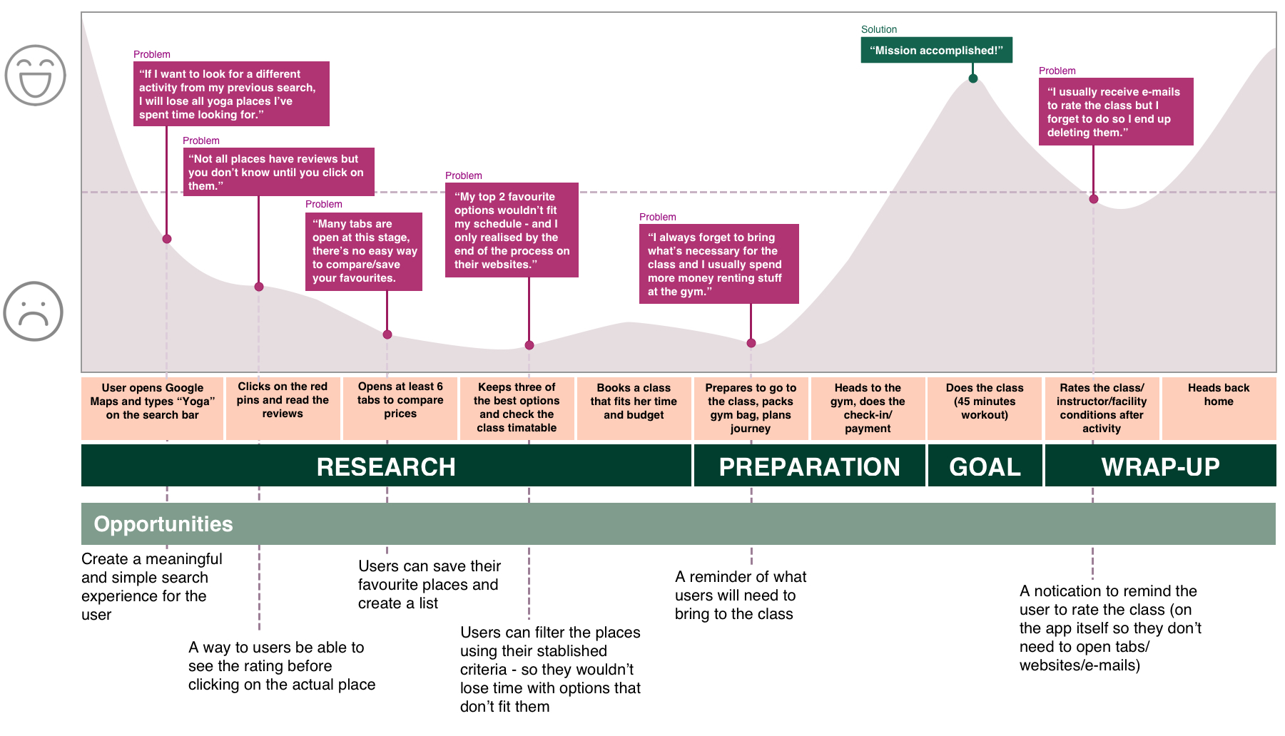
With the map above, I could clearly see which were the areas with a lot of room for improvement and also an opportunity to build something that could help Valeria to achieve her goals.
Day 2 – 9AM: Sketching my first ideas and preparing for the first testing session
Valeria was spending too much time researching the classes and activities she was interested in and still couldn’t find all the information she wanted (e.g. booking classes that are not too busy or almost full).
My first sketches helped me to highlight some tools I thought would be important so I could build my first prototype and iterate it during some user testing interviews.
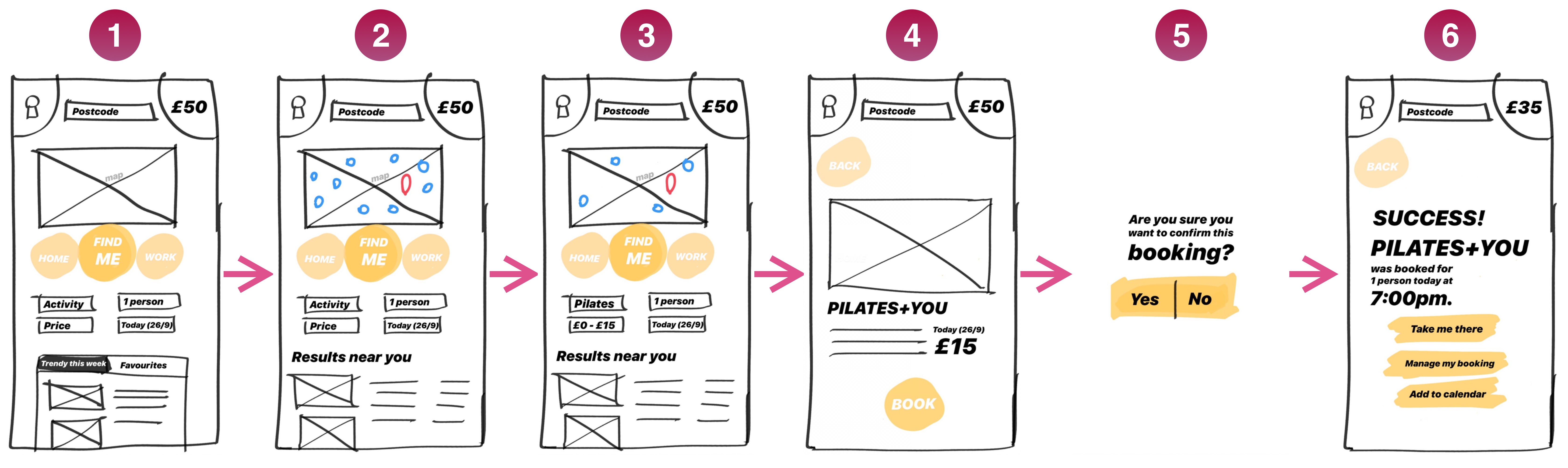
After doing 4 user testing sessions with different people (Valeria was one of them), I’ve collected some valuable feedback that was showing what wasn’t working:
- Users were expecting the map would know already where they were as soon as the app was loaded;
- “Postcode” on top was confusing;
- Valeria was missing an easy way where she could check how many people will attend a class;
- The user icon on the top left was looking like a keyhole;
- Users were missing the taskbar at the bottom.
- Users were expecting the map to be bigger.
The feedback collected from all four different users were pretty similar so it was easy to understand what I would need to change on the prototype. So I’ve created the second version – also the one I’ve decided to move forward with.
Day 3 – 10:15AM: Am I following the right path?
Well, I wasn’t sure if I was on the right track after the changes I’ve done since Day #2 so I still had to validate my previous findings applying all necessary changes to a new prototype and… TEST TEST TEST TEST!
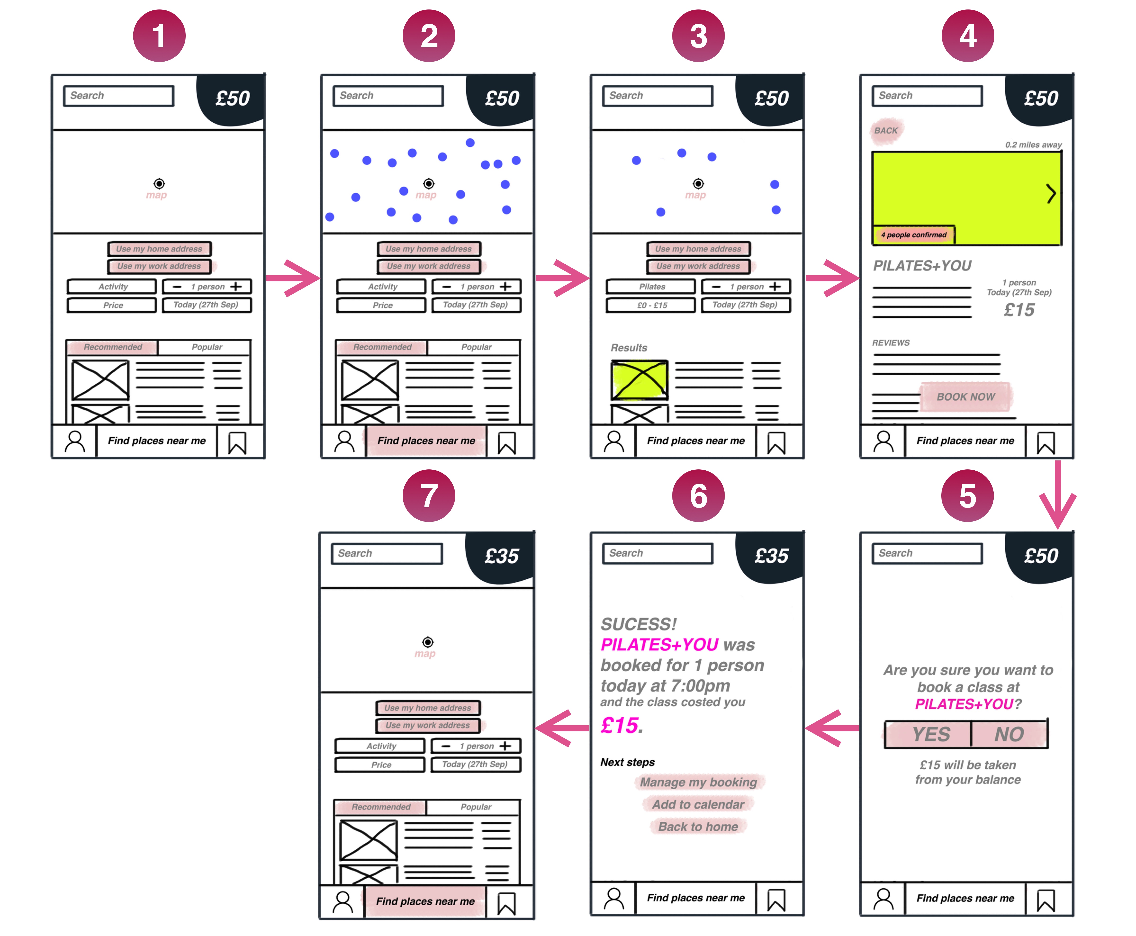
After testing this last version, users were able to complete their tasks smoothly. Some feedbacks were still important to improve the whole experience and flow:
- Buttons below the map (Find my home/work address) were not necessary as they were using the map’s space.
- The map could still be bigger as it’s part of the app’s main functionality.
- The layout looks fine but it seems a bit heavy.
Day 4 – 9:45AM: Okay, let’s do the mid-fi prototype
I’ve done a good amount of user testing sessions and collected valuable feedback. It was about time to implement the final changes after all the iterative process and move on with the high-fidelity prototype on Sketch.
When I started to create the hi-fi prototype, I thought the whole layout was still too blocked will all the lines around buttons and structures. The content below the map was also making the whole app experience look a bit too busy for a mobile screen.
I decided to do something: start the whole concept from a blank Sketch document – and iterate it again. I once heard that in order for us to deconstruct something, we need to have a solid base – and I felt I had everything in place to do it. And I will show the final screens and user flow a bit later.
Day 9 – 7AM: What happened to the other 4 days?
I’ve spent days 5-9 focused on the Brand Vision for the app – the whole visual and UI concept after solving the previous problems. Now it was time to implement the concepts and create a meaningful product combining both UX and UI findings. It was a good break for myself to deconstruct the blocked layout I’ve had previously and move further to create something better.
Elevator pitch
If I could summarise the app in 1 minute, what would I say?
Work Me Out is an app for busy people who need to include some exercise/activities into their routines and budget. Work Me Out leads to quickly booking gym classes nearby that will fit your purpose and will save you time and money. Unlike the competitors, our product offers all booking services you need in one place.
Brand Personality & Statements
Work Me Out is…
– Flexible but not Messy.
– Clean but not Empty.
– Charming but not Pretentious.
– Calm but not Boring.
– Fitness but not Niche.
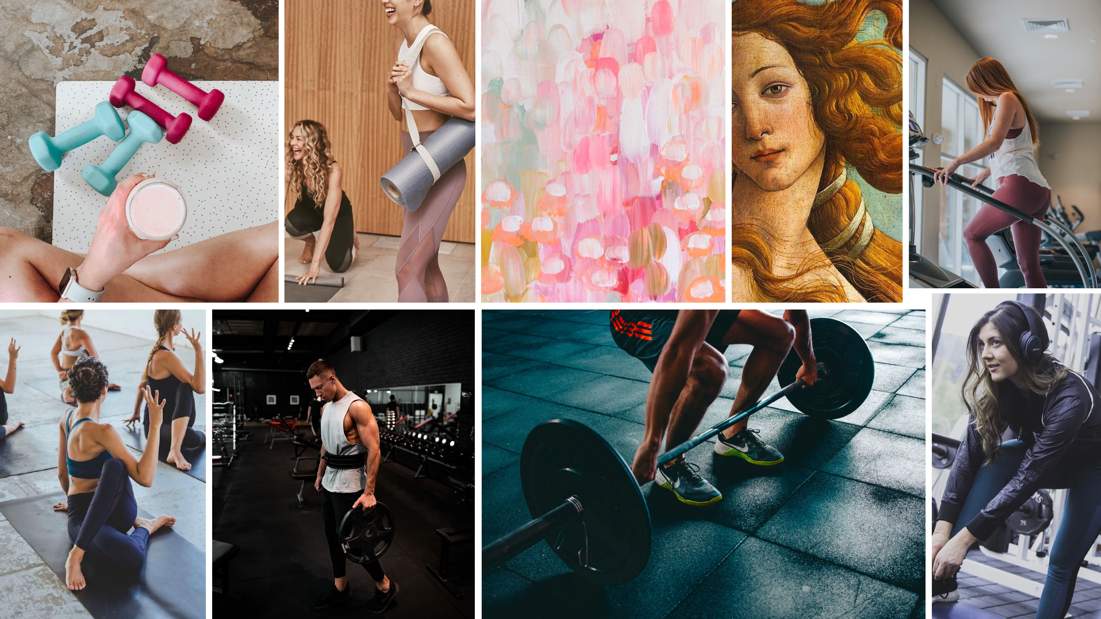
Moodboard
Brand Positioning
When it comes to sensations, colours and general communication, Work Me Out would be placed on the matrix:
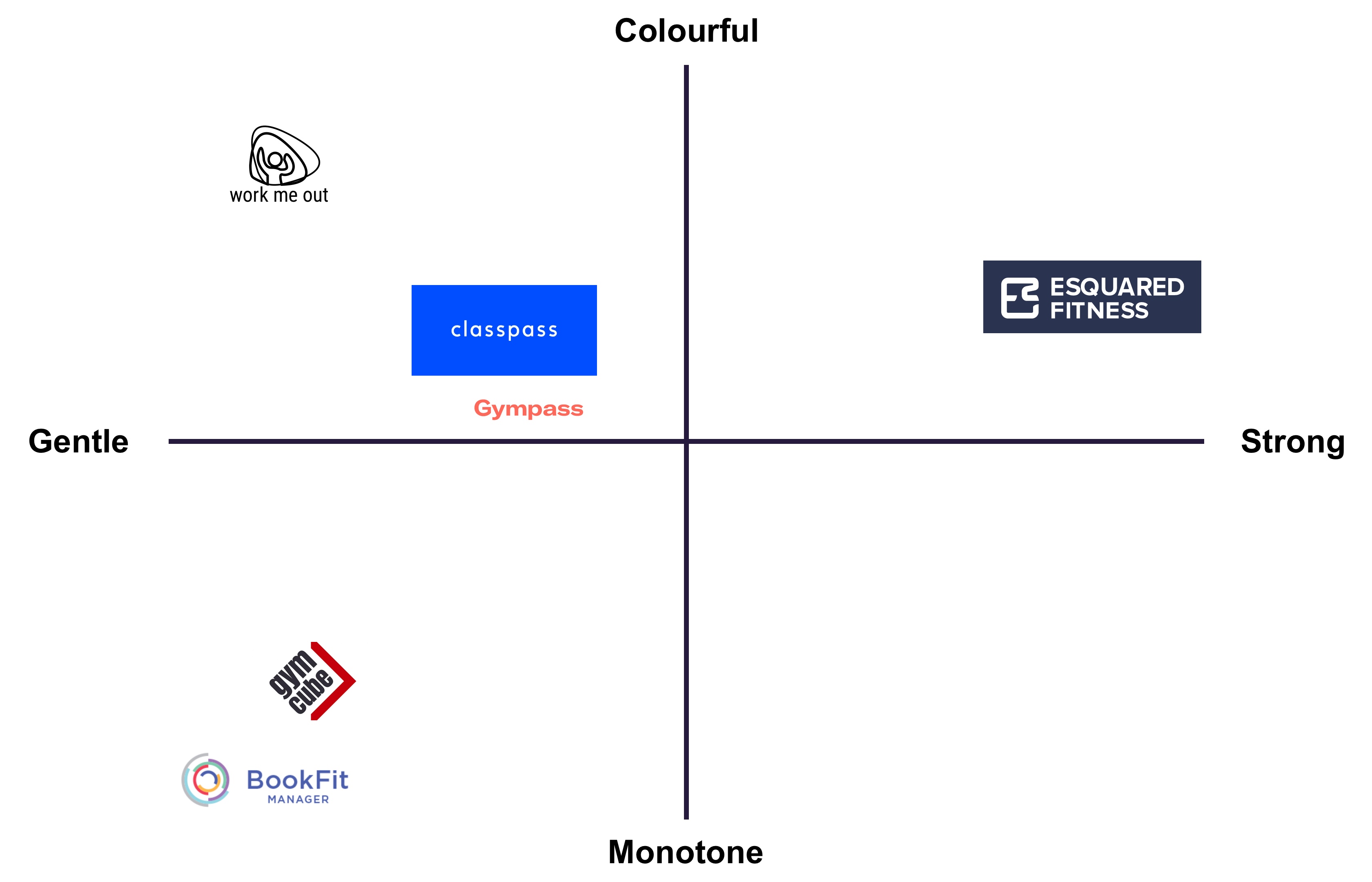
I really wanted to explore the place between Colourful and Gentle as the app was meant to give this soft atmosphere while motivating users to exercise.
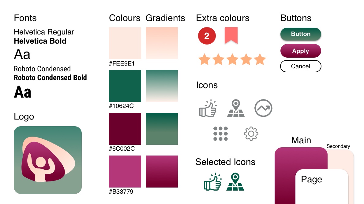
Style Guide
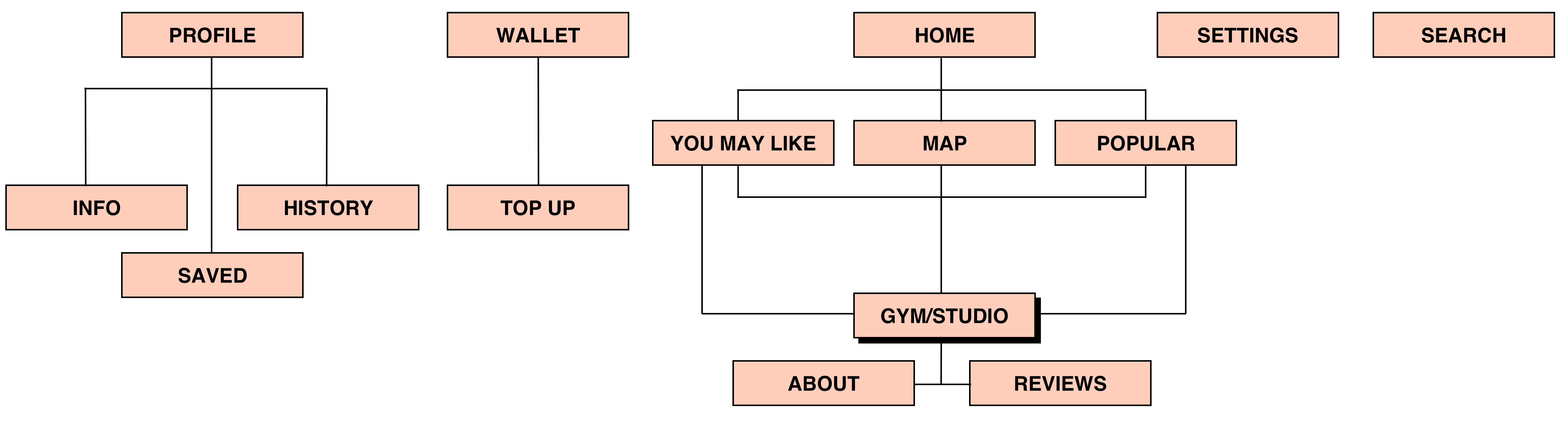
App Map
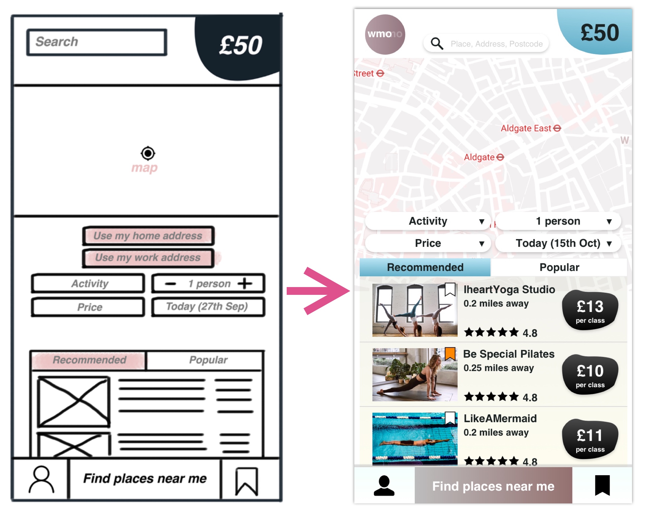
Wireframe Changes
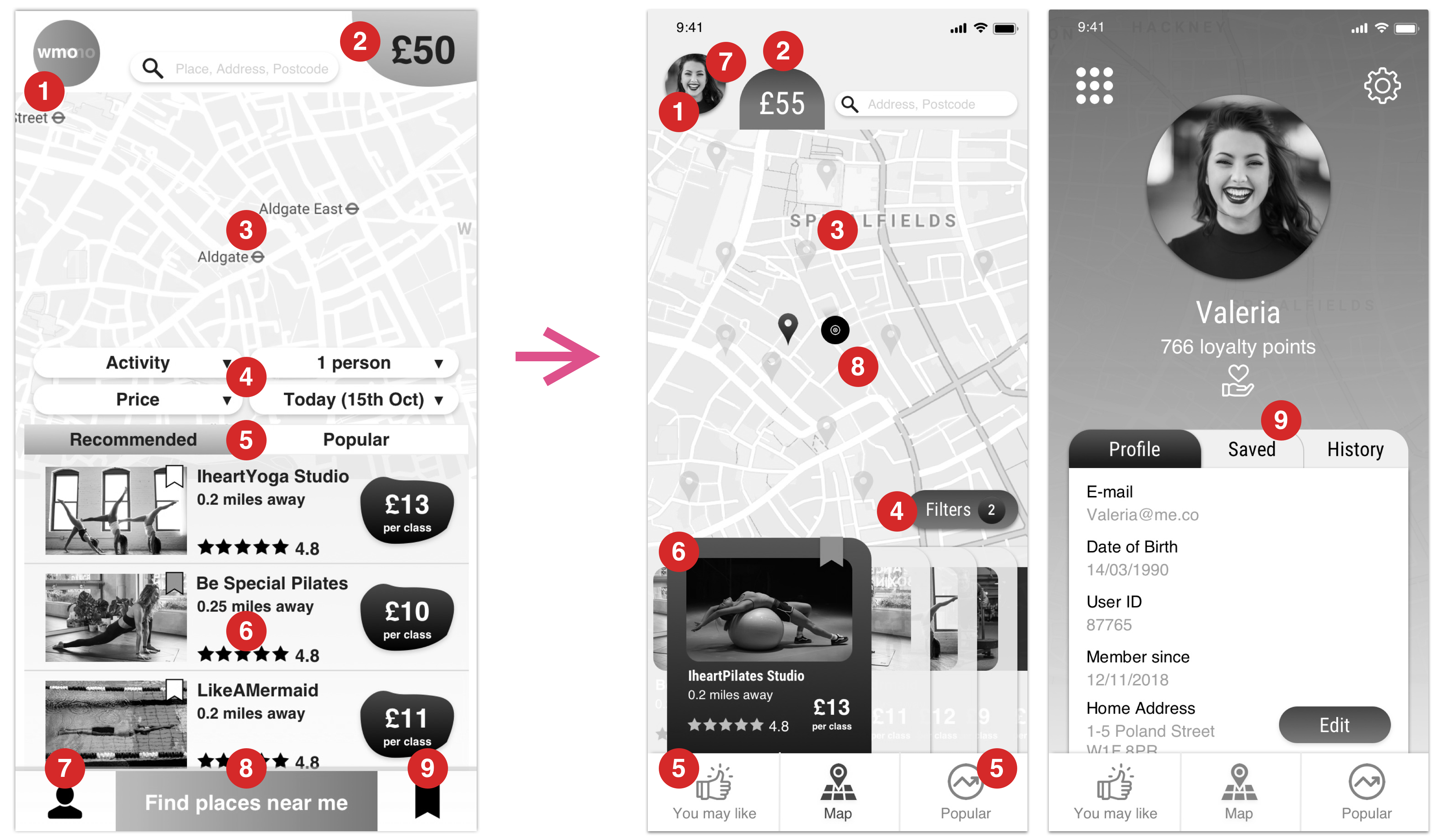
1) App icon gave space to the profile picture – giving access to your account, saved and history.
2) Wallet/Balance: Moved from the bottom top to sit next to the profile.
3) Map is bigger: as the main feature on the homepage, users can quickly explore places nearby.
4) Filters were removed from the homepage so they are now options that will appear once you click on the button.
5) Recommended and Popular options are now on the main menu bar at the bottom.
6) “Find places near me” is no longer necessary once app will automatically do it for users.
7) Profile moved to the top where the logo was previously placed.
8) Added the current location on the map so users will know where they are.
9) “Saved Places” is now a section of your personal profile.
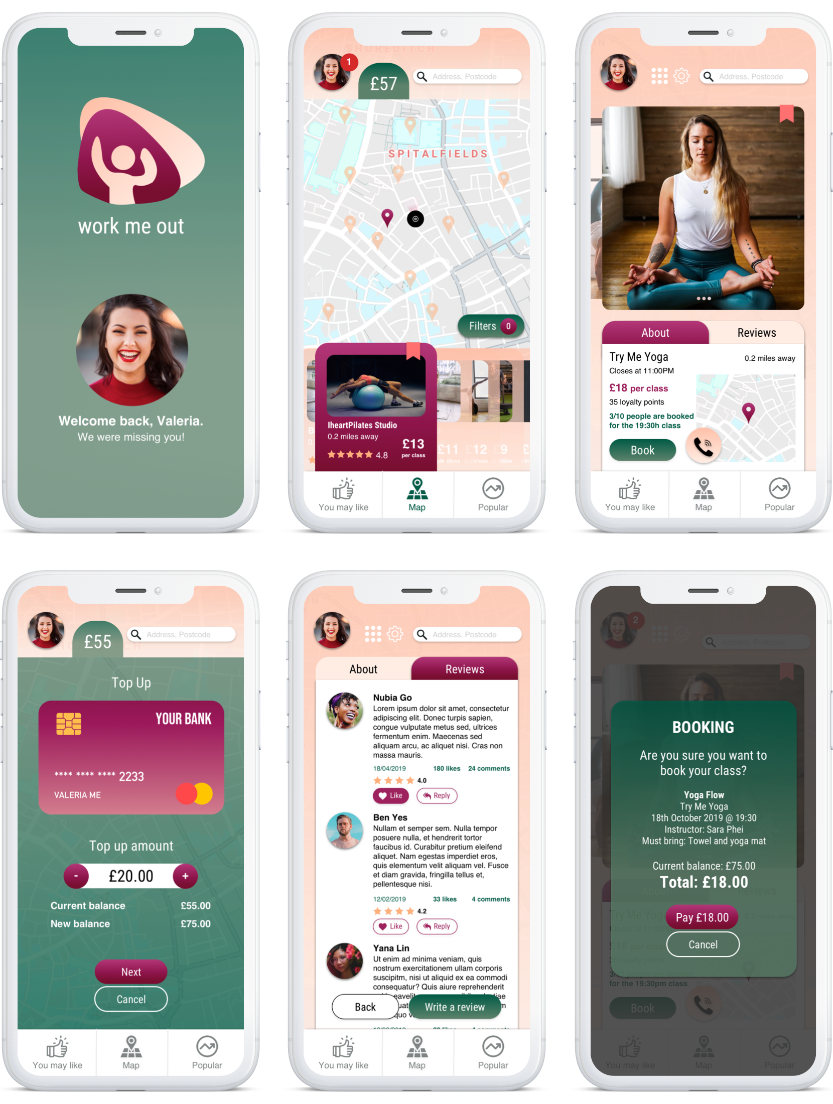
Final Prototype