YoShelf Groceries
Conceptual Project: designing an e-commerce website for a local grocery shop

Role
UX Researcher/UI Designer (Solo Project)
Duration
2 weeks
UX Techniques
Competitor analysis | User interviews | User persona | Experience mapping | User flows | Wire-flows| SiteMap | Sketching | Prototyping | User testing
Tools
Sketch | inVision | Photoshop | Pen and paper
The Brief
For my second project as part of the User Experience course at General Assembly in London, I was tasked with creating an e-commerce website for a local independent grocery shop.
My client was YoShelf groceries. They’ve been the City’s neighbourhood grocery store since 1998. Located near Liverpool Street Station, they are proud of being part of a dynamic community.
Their business model is based on customer service, reasonable pricing and keeping it local — employing local staff and supporting the community they serve.
Through a new e-commerce desktop website, YoShelf wants to showcase their products while maintaining their brand image.
CHALLENGES
YoShelf defined a few priorities on their brief. The new website must:
- Have clear ways of locating specific products
- Support a single page for each product which can be linked to directly
- Have an efficient means of purchasing one or more products
- Steer costumers toward popular products
- Establish the brand and its points of difference
- Allow customers to contact the business (including to request a product not otherwise stocked)
Research
Contextual Inquiry
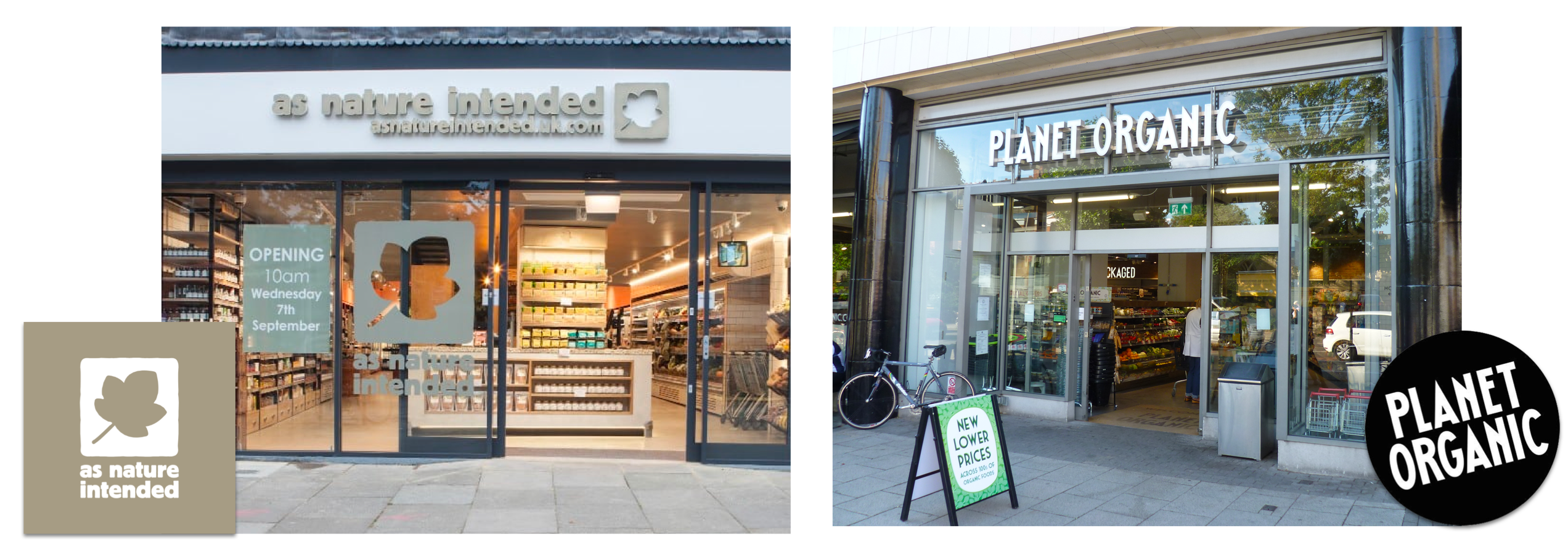
To understand the problem scope and the experience of users when buying groceries, I went to Planet Organic and As Nature Intended to understand what were the pain points of customers during their shopping process. Both shops were near Liverpool Street Station – where YoShelf is also located. I conducted Contextual Inquiry observations and interviews with customers and staff to collect feedback that could help with my research.
Insights:
- Customers would ask for a specific product from a brand showing staff the requested product with their phones.
- They would compare prices in-store with prices they were browsing online — knowing they were making the best deal was important.
- They would browse products but were not sure of what they actually needed — some of them were wishing they’ve brought a shopping list instead of randomly wandering around the aisles.
Note:
This exercise confirmed that there was an opportunity to make YoShelf’s website a unique offering in the groceries market by showcasing their expert advice and also creating an experience on the website that supported costumers when buying.
Competitive Analysis
The second step of the process was to do a Competitive Analysis to understand what the competitors were doing. I was also looking for potential gaps in the market to stand out.
I conducted research of YoShelf’s direct and indirect competitors using the following methods:
- Features analysis of competitor’s websites
- Contextual inquiry & site visits to local competitor shops
- Interviews with shoppers & staff at these competitor shops
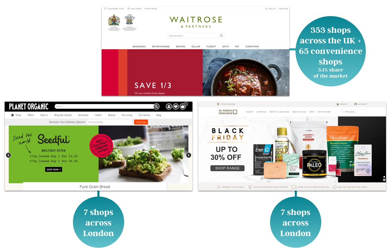
As one of the UK’s biggest groceries shop, Waitrose has a “Recipes” section on their website with many different categories but there are no actions that users can take from there to the actual products. A big and corporate e-commerce website wasn’t what my client wanted, it wants to keep its brand image as a local small shop focusing on hand-picked quality over quantity.
Planet Organic and As Nature Intended were good shops to compare as they had some physical shops in East London — and offered great hand-picked selections for customers.
User Interviews
Based on surveys and interviews with customers to understand their shopping behaviours, I identified the main needs I wanted to address in the website while also taking into consideration the needs of YoShelf.
- Clear product organisation for a seamless shopping experience
- Easy product search
- Helpful product suggestions that reflects YoShelf expertise and focus on the local area
- Detailed product information to ensure customers are buying the right product to attend their needs
- Product reviews to help make informed buying decisions and allow for user input
- Efficient checkout process to save users time
Persona
From my interviews, I’ve synthesised the data collected and created my persona. John was based upon my research to represent the different user types that might use our client’s service — helping me to understand users’ needs, experiences, behaviours and goals.
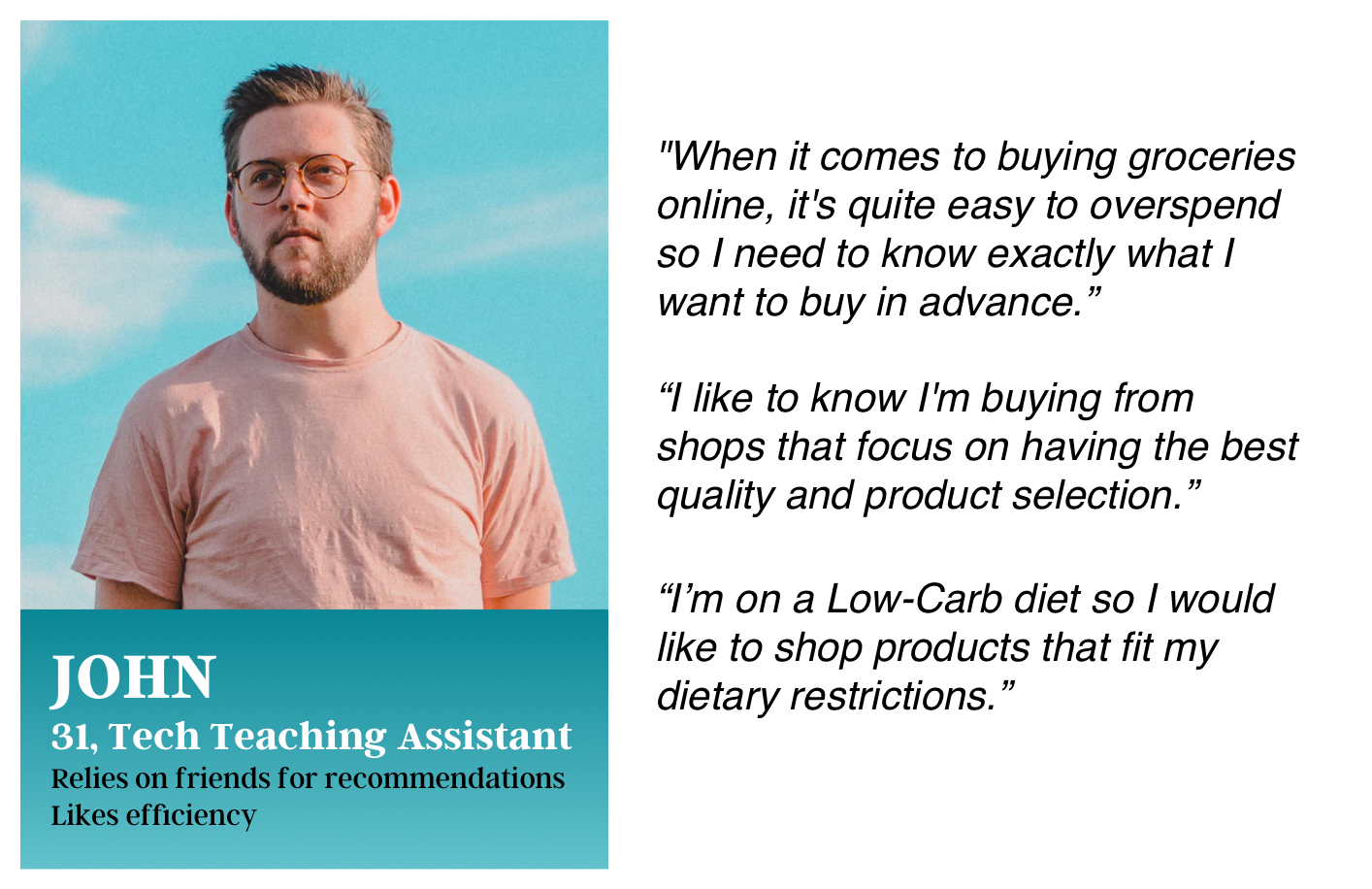
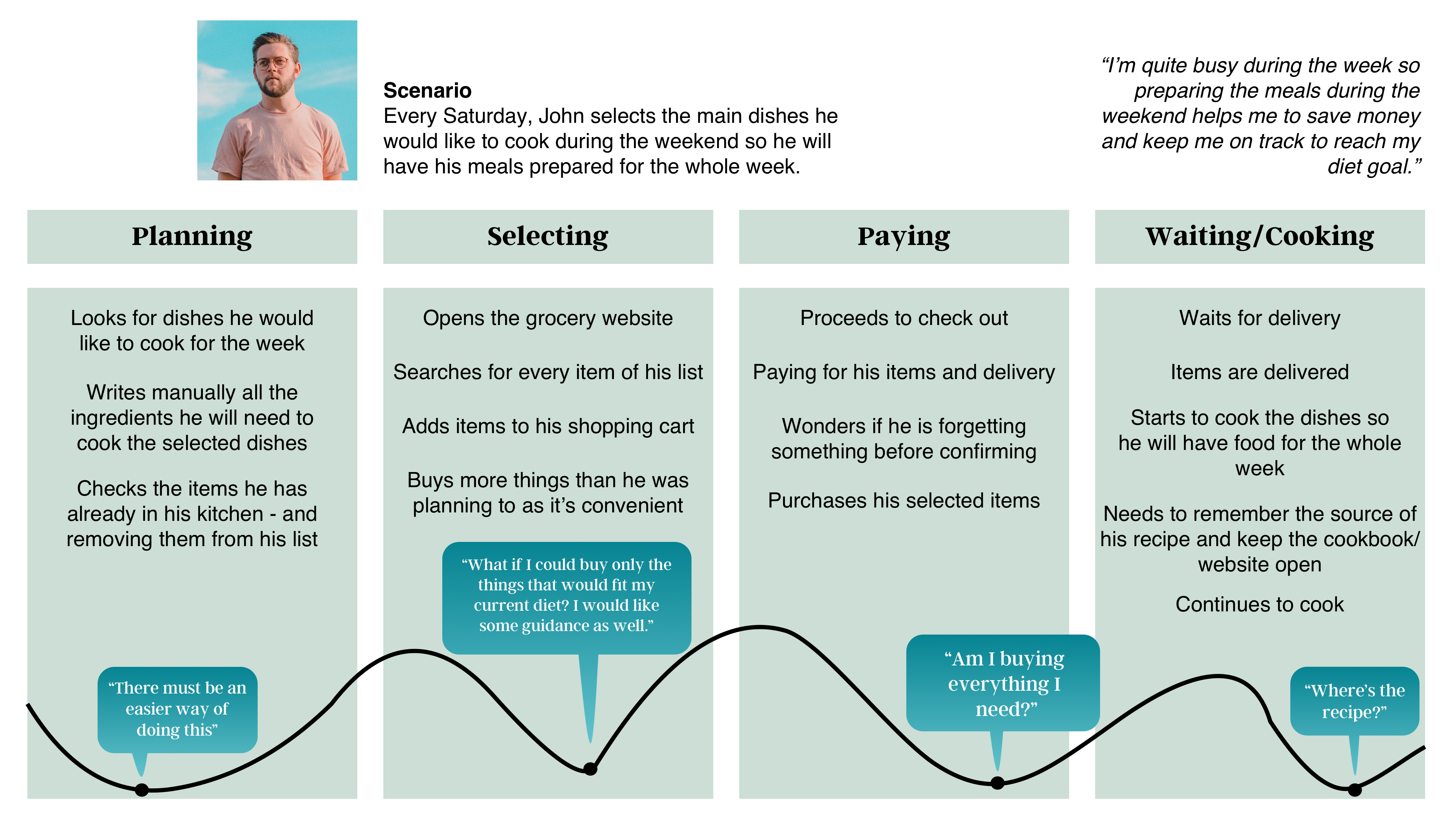
John’s customer journey was also created to show how his behaviour and the pain points while buying groceries online.
Findings:
- John doesn’t always shop online because he needs to know what to buy and what he wants to eat — so he usually wastes time browsing randomly.
- He’s currently on a Low-Carb Diet — which links to my “Lifestyle” idea that will be introduced later.
- He would like to buy more at Waitrose but he doesn’t find shops nearby — a great opportunity to introduce our e-commerce service.
- He values great quality and product selection — which the client offers.
Site Structure & Navigation
With Information Architecture being an integral part of a customer’s experience of a website, I conducted a card sorting exercise using a sample inventory of YoShelf’s products. My main finding was that it is necessary to have two ways of browsing for a product:
- By product category (e.g. Bakery, Vegetables)
- By lifestyle (e.g. Low-Carb, Gluten-Free)
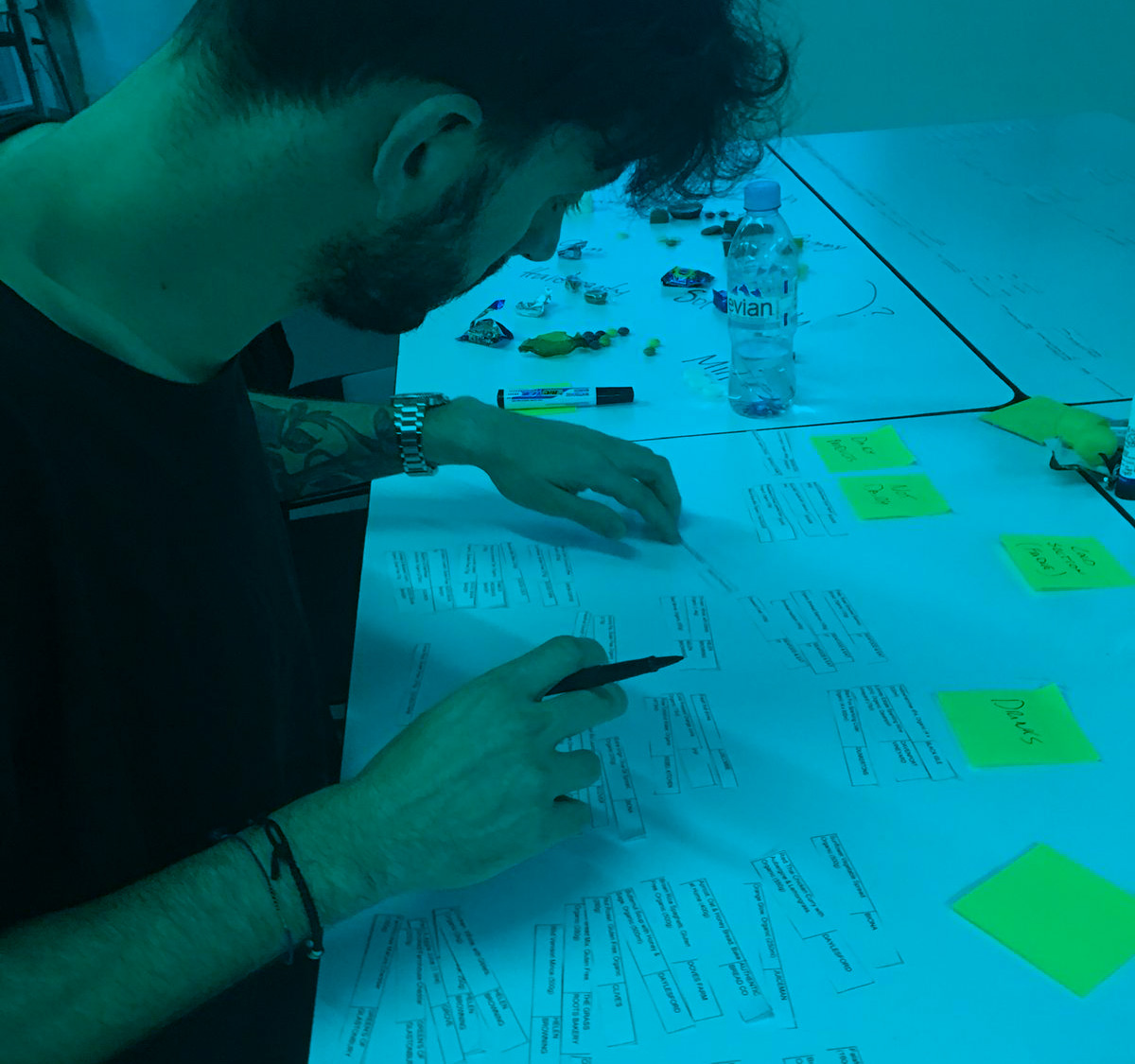
During a card sorting session, participants were asked to organise products from the shop inventory into categories. This would later on be crucial to label these groups making all products more accessible and easy to find on the website.
Insights:
- Cultural/Language barriers are a challenge as people come from different backgrounds — which leads them to categorise items according to their personal experiences/cultures;
- Not all categories are the same to everyone as people have different criteria — which are not always obvious;
- If you have a serious allergy conditions/specific diet, you need to shop for products you can consume (e.g. dairy-free/vegan), as most products aren't suitable.
One of my card sorting participants was Vegan so she gave me a very precious insight. When it comes to buying groceries, we should consider some people follow different lifestyles and they would like to feel like there’s somebody paying attention to their needs and life choices. Instead of categorising the inventory in Meat/Fish/Bakery/etc, the vegan user classified as:
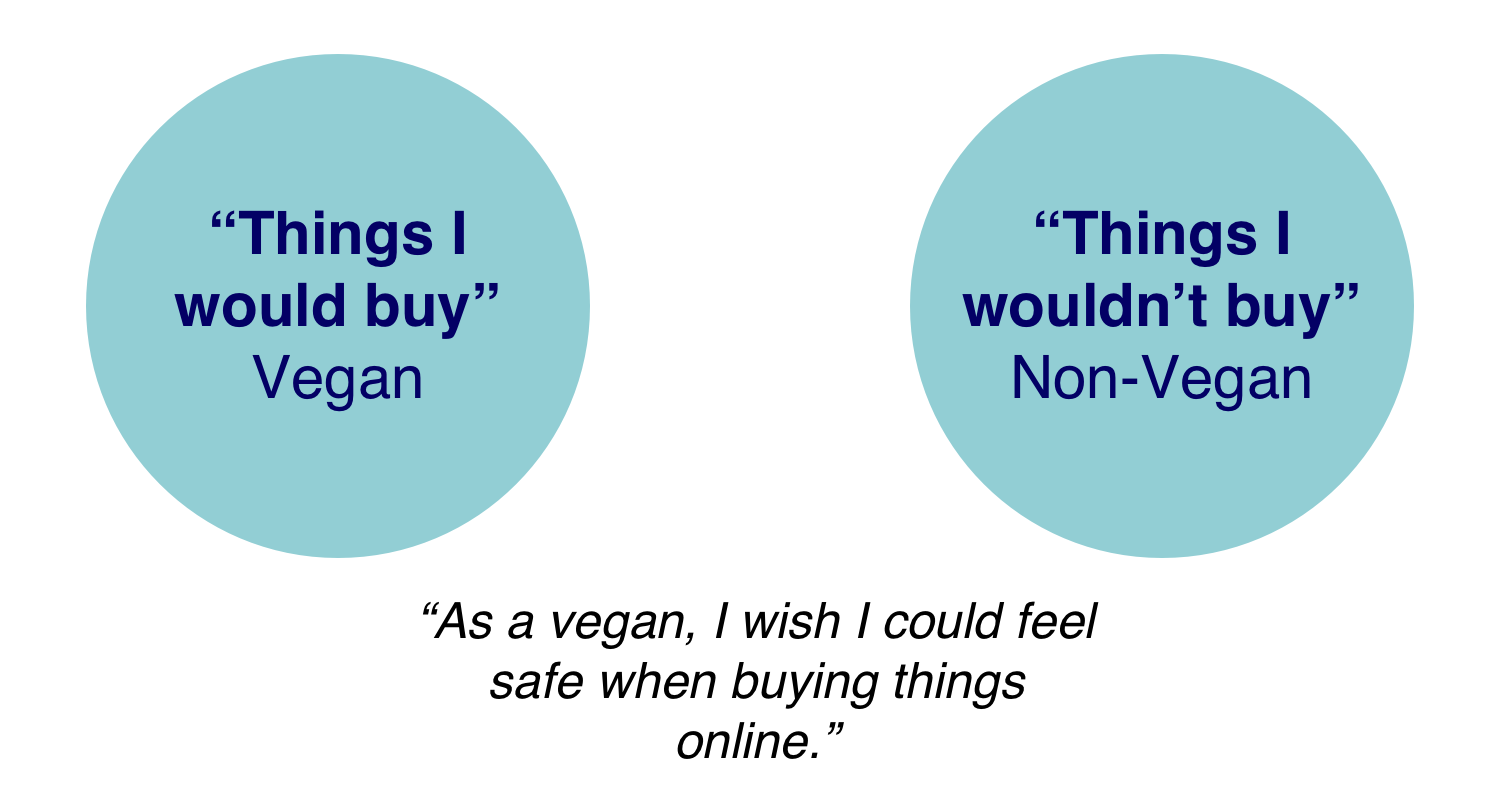
My main learning from this session is that buying groceries is painful for customers with dietary restrictions. So why not change it so we can make those users feel cared and considered?
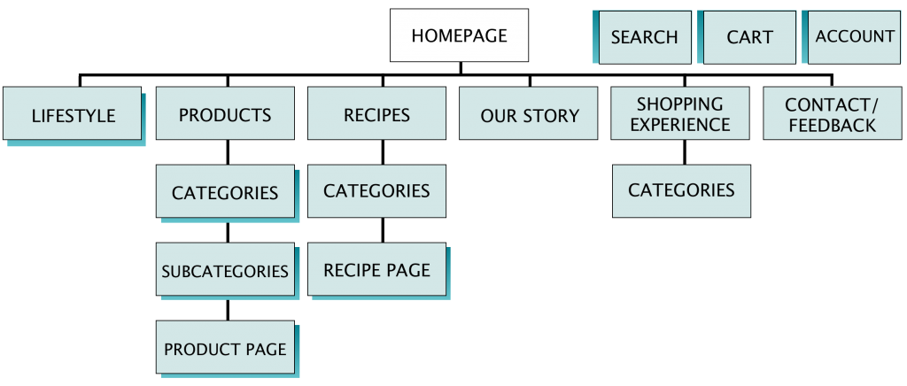
Sitemap
A sitemap is a diagrammatic representation of a hierarchical system. It usually depicts the parent-sibling relationship between pages in a website, showing how subpages might be arranged underneath their parent groupings:
Global Navigation
How users would find what they need in the website
User Testing & Iterations
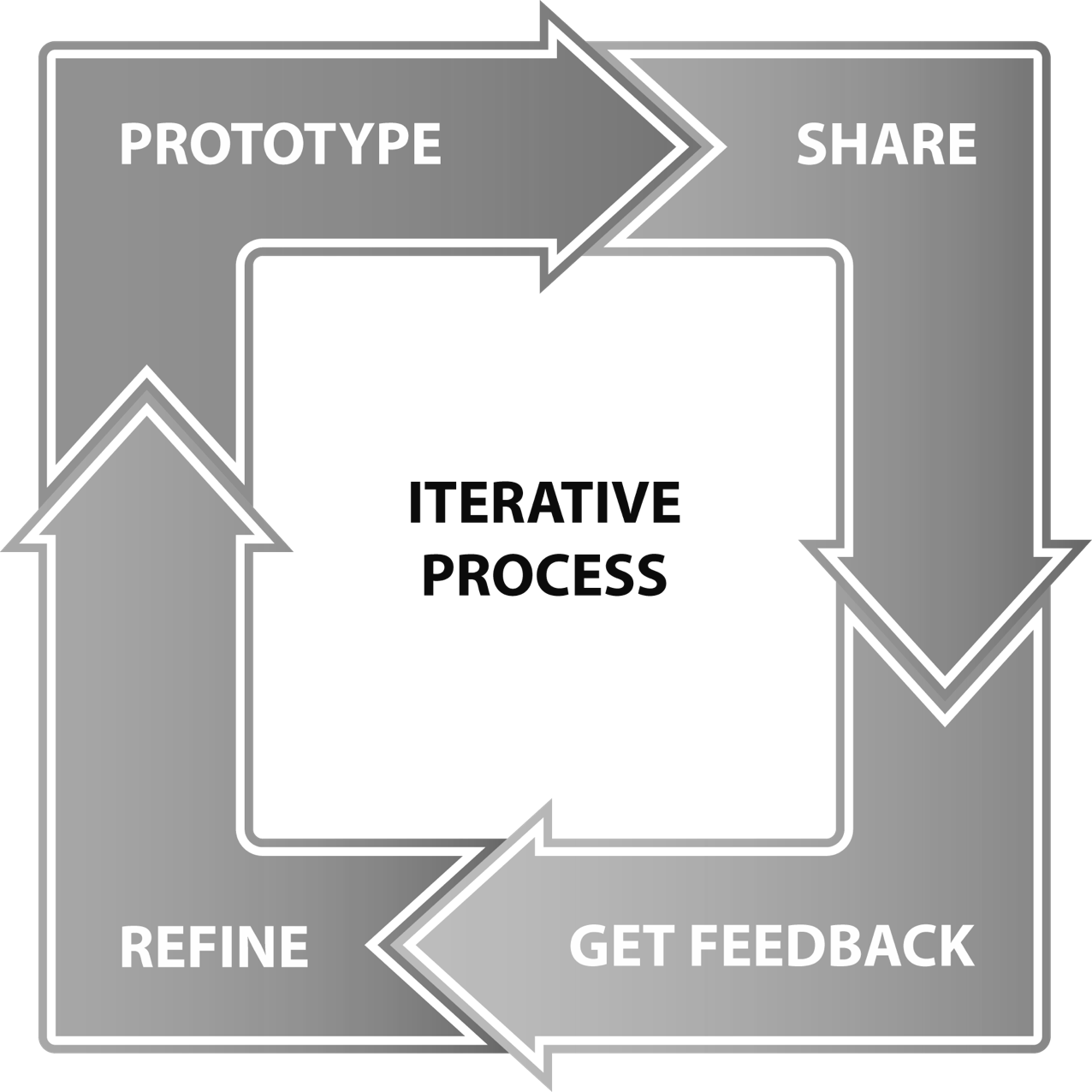
To understand if we were on the right path for this project, we tested the first prototype with users. This followed the iterative process:
Once you have identified a user need and have generated ideas to meet that need, develop a prototype. Test, collect feedback and refine. Following that, you create a new prototype and begin the process all over again until you are satisfied that you’ve reached the best possible product for release to the market as a Minimum Viable Product.
During my testing sessions, I gave the users a scenario with three tasks for them to complete :

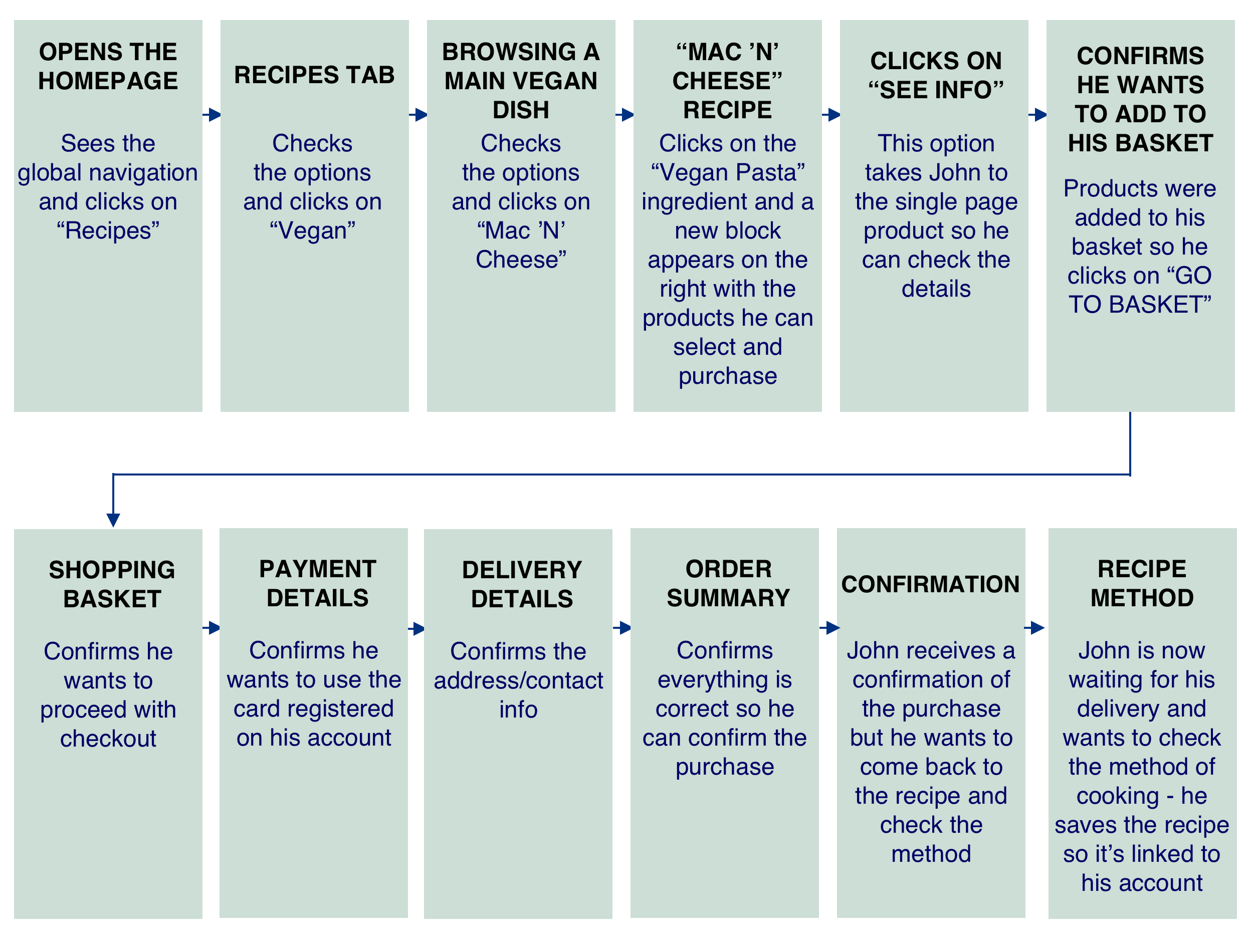
After that, I created the happy path for John (otherwise known as the critical path) — steps he would need to take to complete all given tasks according to the scenario:
My first testing insights were:
- It wasn’t clear to users what “Lifestyle” meant;
- Delivery Option — you need to know the shipping cost will be added later — it should be mentioned somehow;
- Users were confused about the menu — words were too close together;
- We would need to have a page confirming your purchase/order would be sent via e-mail.
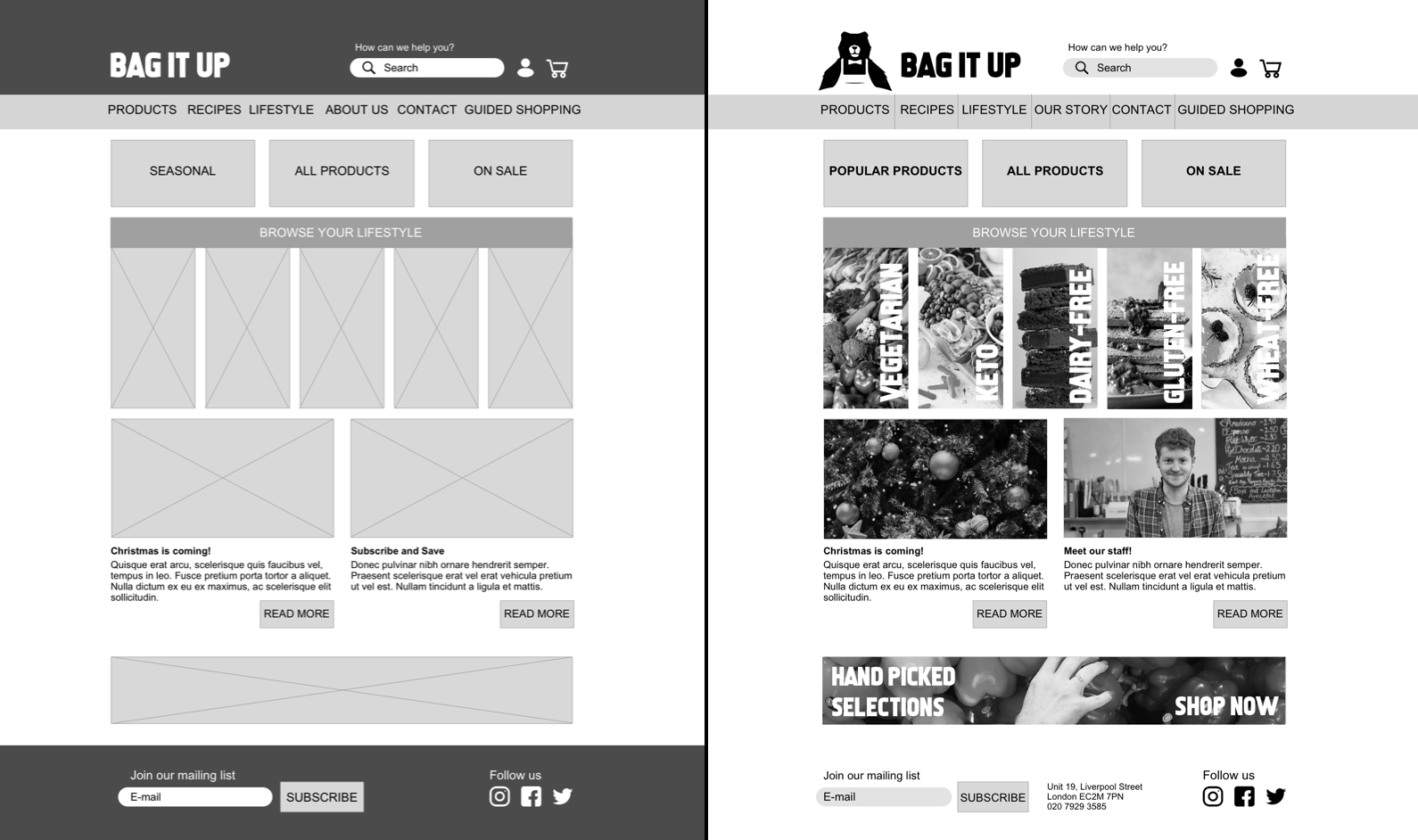
Over the course of a week, I did more than 15 usability tests for five prototype iterations:
Solutions
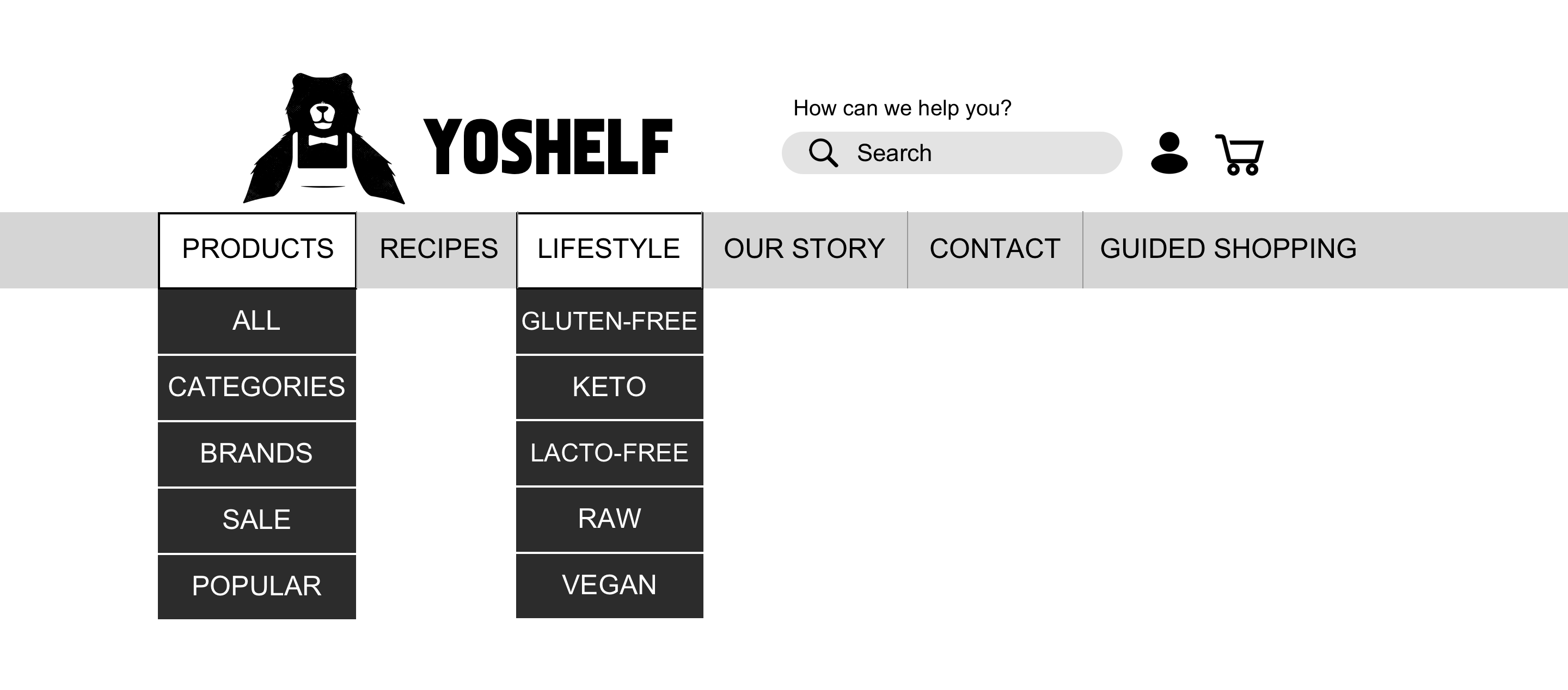
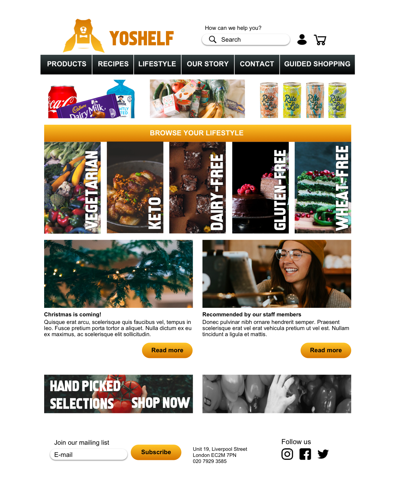
If we take a closer look at the Homepage:
- Global Navigation Menu: An easy way for you to find yourself throughout the website — it will appear on every page in case you want to use one of the menu options.
- Browse Your Lifestyle: an easy way to help the customers find what they need. The pictures and words help users to understand what “Lifestyle” means.
- Meet our staff: To keep the sense of a local business where you can meet the staff and get in touch if customers want to. Once they click and are redirected to the staff page, customers will be able to read some recommendations and interesting content produced by the staff — for example, interesting recipes or recommended products.
- Hand-Picked selections: The importance of highlighting that the business cares about what they sell — quality over quantity.
- Bottom Menu: Customers can sign in to the newsletter and receive offers and news (about the shop or the local community) and clients can also get in touch if they want (via phone, or social media). The main point here is to establish a connection between the business and the customer.
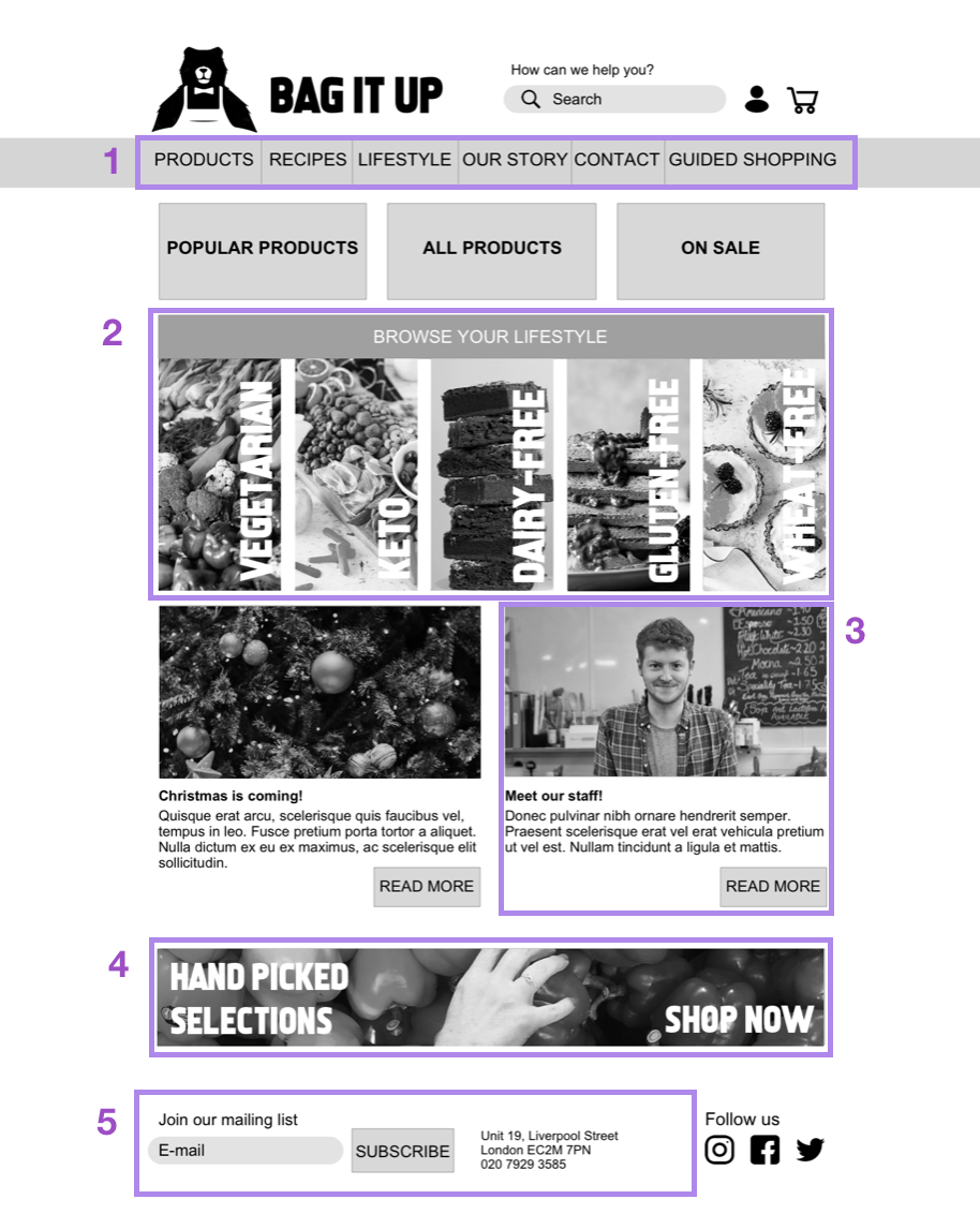
Homepage – Hi-Fi Prototype as an example
Next Steps
- Develop the guided shopping tool
- Apply colours to all screens and create a high-fidelity prototype
- Continue testing with users
What I’ve learnt…
I’ve learned how important it is to document every single step of the whole process. As a UX Designer, the amount of data we can collect is impressive and it’s quite important to keep a track of the whole process. As it was a solo project, it was a Research and Ideation process I had full control over from the brief until final delivery. Working on a brief like this was both challenging and incredibly rewarding. As this was a concept project, I was unable to go back to the client with our findings and had to find a way to incorporate user insights with the brief.