UX/UI Case Study: Optimising a Charity e-Commerce Experience
Re-designing the whole online shop to attract customers to purchase daily living aids and increase the revenue for the charity

Role: UX Researcher/UI Designer (Group Project)
Duration: 2 weeks
UX Techniques: User Research | Competitive Analysis | Data Analysis | Screening survey | User interview | Sketching | Sitemaps | User Flows | User Testing| Wireframing | Prototyping
Tools: Sketch | inVision | Photoshop | Pen and Paper
The client
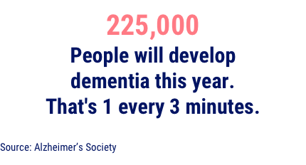
Dementia is the UK’s biggest killer. Someone develops it every three minutes and there’s currently no cure. Alzheimer’s Society is the only UK charity that campaigns for change and supports people living with dementia today.
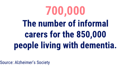
As the largest and most influential dementia charity in the UK, they fund research into the cause, cure, care and prevention of the disease. They also campaign to change society and funds research and innovation to improve care and ultimately find a cure.
The Alzheimer’s Society Online Shop sells assistive products to help people to live well with dementia. Alongside this, they sell a wide range of cards and gifts, branded merchandise and books on dementia.
Brief and project objectives
- Helping users better understand the products, including their features, benefits and related advice. Alzheimer’s disease is the most common form of dementia but there are many others with different symptoms and rates of progression. The quality of information and advice about daily living aids is very important so users are able to compare features and understand the benefits of the products.
- Ensuring that their USP is clear, in the context of the competitive landscape. As the scale of dementia increases, commercial retailers see a market opportunity. Their USP is the quality of products and the fact that 100% of their profits support the good work of the charity.
- Improving the way that VAT / VAT relief information and options are presented. Many of their daily living aids are available VAT free to people with dementia or a qualifying medical condition and those purchasing on their behalf. Those needs must be declared at the point of purchase before check out.
- Any suggestions for improvements to the overall UX and UI of the shop.
Why this brief matters
“Alzheimer’s Society recognises the value that digital user experience and inclusive design can make to meeting the needs of our service users, along with our strategic mission. However, we currently have a single UX Architect to run user-centred design practice across our total estate of dementia support services and products.
This serious experience design resource bottleneck, along with our limited budget/resources as a charity, means that our shop service has never received the investment in UX that it deserves. It's affecting our ability to raise vital income from our shop. It is also affecting how we join-up people in crisis with products which would help people affected by dementia to live well and longer in their own homes.”
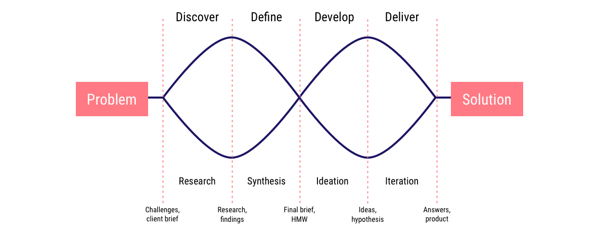
Double Diamond approach
Double Diamond is the name of a design process model developed by the British Design Council in 2005. Divided into four phases — Discover, Define, Develop and Deliver — it is probably the best known and the most popular design process visualisation.
The main feature of the Double Diamond is its emphasis on the “divergent” and “convergent thinking”, where first many ideas are created, before refining and narrowing down to the best idea. This is happening twice in this model—once to confirm the problem definition and once to create the solution. That’s the approach we’ve used for this project.
Uncovering initial insights

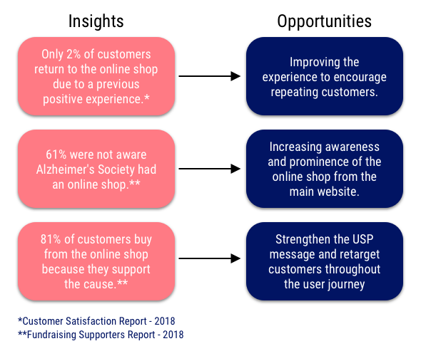
As an established and well-known brand, Alzheimer’s Society has been conducting internal reports for years. As part of their customer satisfaction research, we were able to utilise important feedback provided by their users.
All that data helped to guide us in understanding how we could start the project by analysing the opportunities from each insight. My main contribution here was the ability to synthesise user research and draw valuable insights to inform our final solution. I provided recommendations backed by real data and insights.
Competitive Landscape
As a way to understand more about what competitors were doing when selling daily living aids, we selected some examples of dos and don’ts. Competitive analysis helps us to understand and explore opportunities and gaps in the market.
Things competitors did well:
- Ability to search for daily living aids by specific needs
- Clearly communicating the VAT relief
Bad things competitors did:
- Cluttered homepage
- Product information not clearly highlighted
DISCOVERY
To validate the data shared by our client, we wanted to understand more about users’ motivations. We ran a short survey at the end of Alzheimer’s Society checkout process helping us to track some pain points throughout the journey.
We asked users:
- Why did they choose to shop at the Alzheimer’s Society online shop?
- How easy was it to find the product they were looking for?
- What would help to make their purchase decision?
We had 157 respondents who have purchased from the online shop. After filtering through the information collected, six points stood out:
- Supporting the charity was the main reason why users chose to buy at Alzheimer’s Society.
- Users bought from the shop as they were browsing for specialised products.
- Videos and more product pictures would help me to understand how to use the product.
- Product reviews and key features are important when it comes to purchasing a daily living aid.
- Easier navigation would make the journey smoother.
- The checkout process was too long with too many steps.
Part of our discovery phase was to also conduct in-depth interviews. People who recently bought living-aid products gave us important feedback when it comes to purchasing with our client’s competitors.
“My general thought about those sorts of sites (charities) its that they are a bit clunky and difficult to use. There’s one major incentive that would change my behaviour in that sense and make me actively want to buy their products. I would do it to support the charity because it makes sense to put money back into research to find a cure for dementia.”
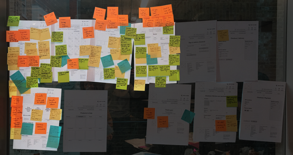
To summarise our insights and quotes from users to understand patterns an affinity map was created with our main findings.
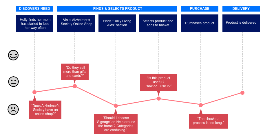
The combination of both testing sessions and checkout survey helped us to map the customer journey when using the current website. We also ran testing sessions on the current website to create an emotional map where we could see the main pain points. Users were asked to complete the purchase of a specific product and talk about the steps taken throughout.
Insights
- Online shop not visible from the main website. When visiting the Alzheimer’s Society main website, customers mentioned the link to the shop was not visible. The button that leads users to the online shop wasn’t showing on the mobile responsive layout. That was a big problem because many customers were not aware that our client had products to sell online.
- Customers were not aware that the shop offered more than gifts and merchandise. Most charities offer only gifts, cards and branded merchandise as a way to customers show their support. It wasn’t clear to users that Alzheimer’s Society had specialised products to offer to help people living with dementia.
- Users were confused about categories and sub-categories. The overwhelming amount of categories available to users were leading to confusion. They were not aware of where to go first and some category names didn’t link to what they really meant.
- Product info wasn’t easy to scan. Users would like to know more about the products as they are specialised. When it comes to buying daily living aids, users said it would be great to understand how they can use what they’re purchasing.
- The checkout process was a bit long. Customers were a bit disappointed due to a long checkout process – especially because there was some confusion when it comes to applying for the VAT relief.
DEFINE
To summarise all our research findings we created our persona – a fictional representation of our users’ insights:
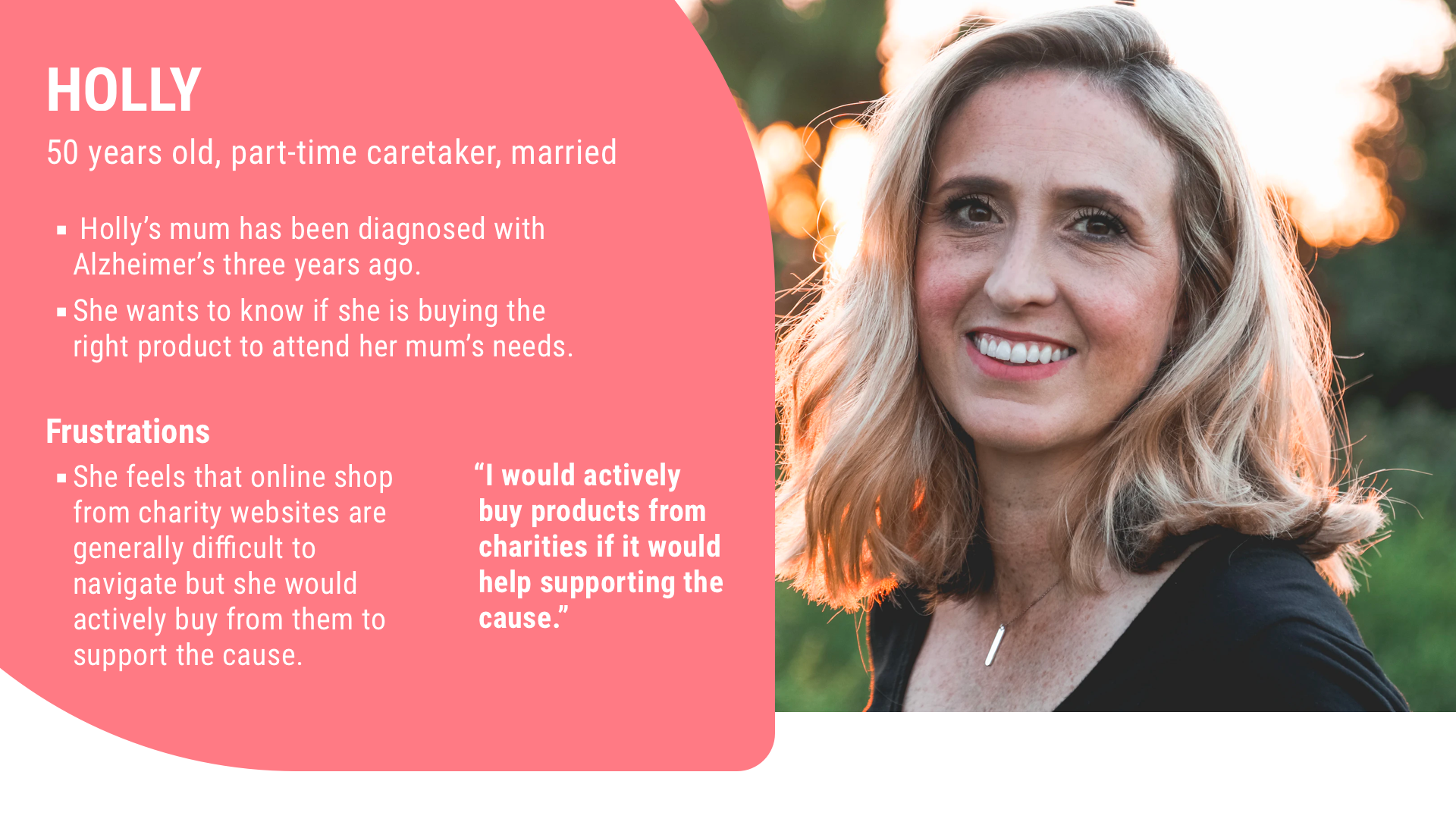
Let’s take a walk in Holly’s shoes
Holly needs to help her mum to be more independent because her mum is suffering from memory loss and Holly can’t always be around to help her.
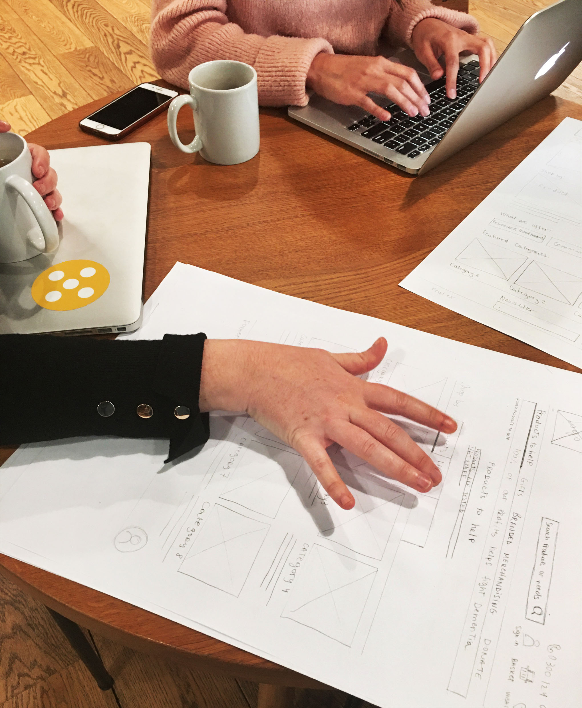
To brainstorm ideas that could help solve users’ problems, we ran a design studio session with our client. It involves sketching possible solutions, sharing and then refining the ideas.
To guide this process we considered the following “How Might We” questions:
How might we?
- Communicate key product features and benefits so it’s easy for Holly to read and understand?
- Communicate that the shop also offers daily living aids rather than just gifts and branded merchandise?
- Better display labels and sub-categories for products so Holly can easily find the right product?

Card Sorting
According to our research, the categories were one of the main pain points in the journey. So our next step was to consider what categories would improve navigation. For that, we conducted a card sorting activity. Users were asked to assign Alzheimer’s Society shop inventory items into predefined categories. The suggested categories were based on our audit of other charity websites.
Card sorting activity also helped us to create sub-categories.
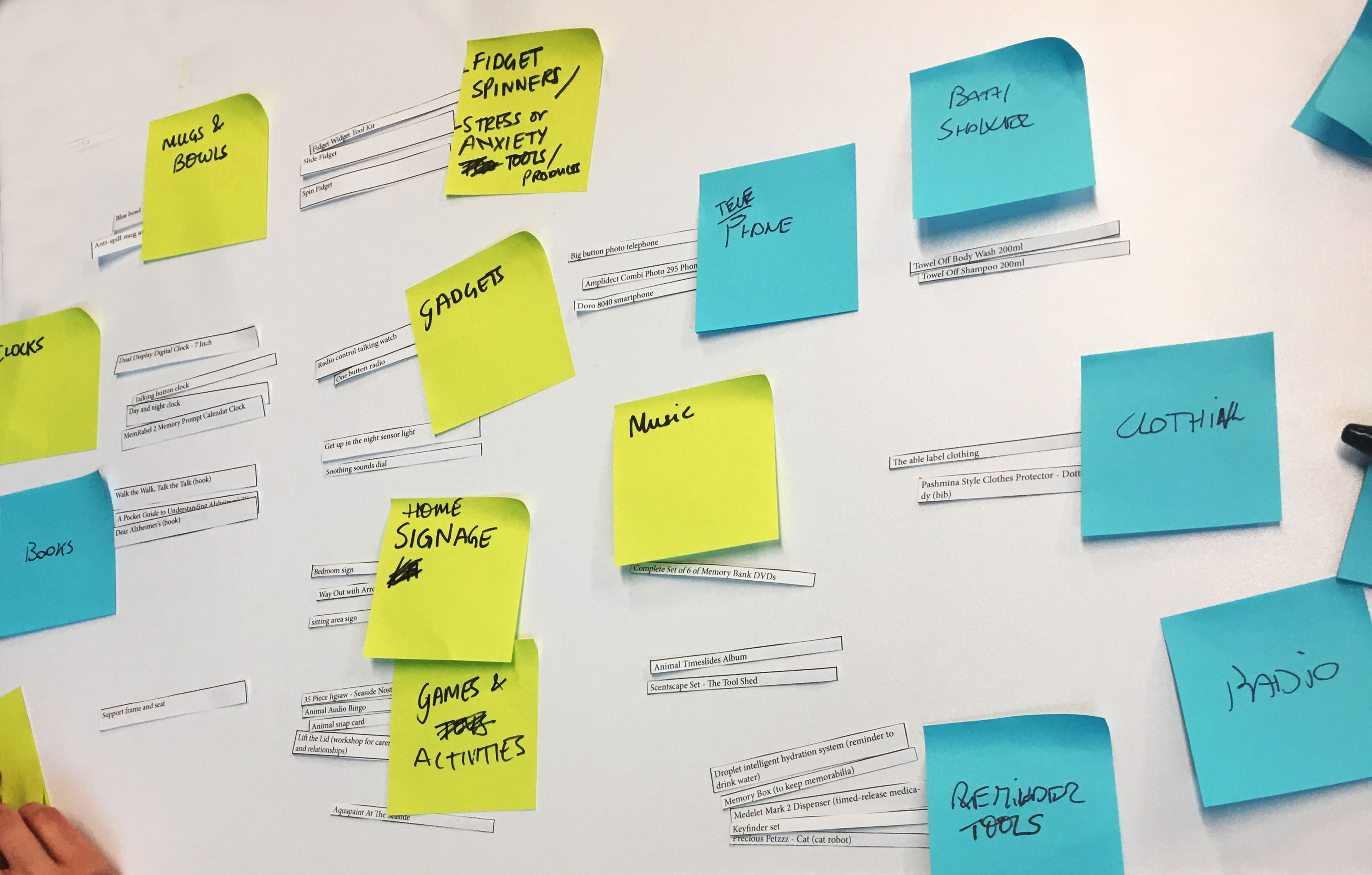
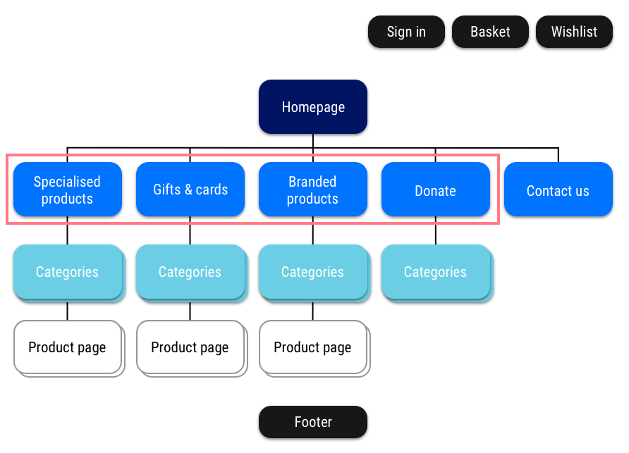
13 users participated in the card sorting activity. From that, we simplifying the categories into:
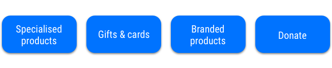
And that’s where they sit within the site map:
DEVELOP
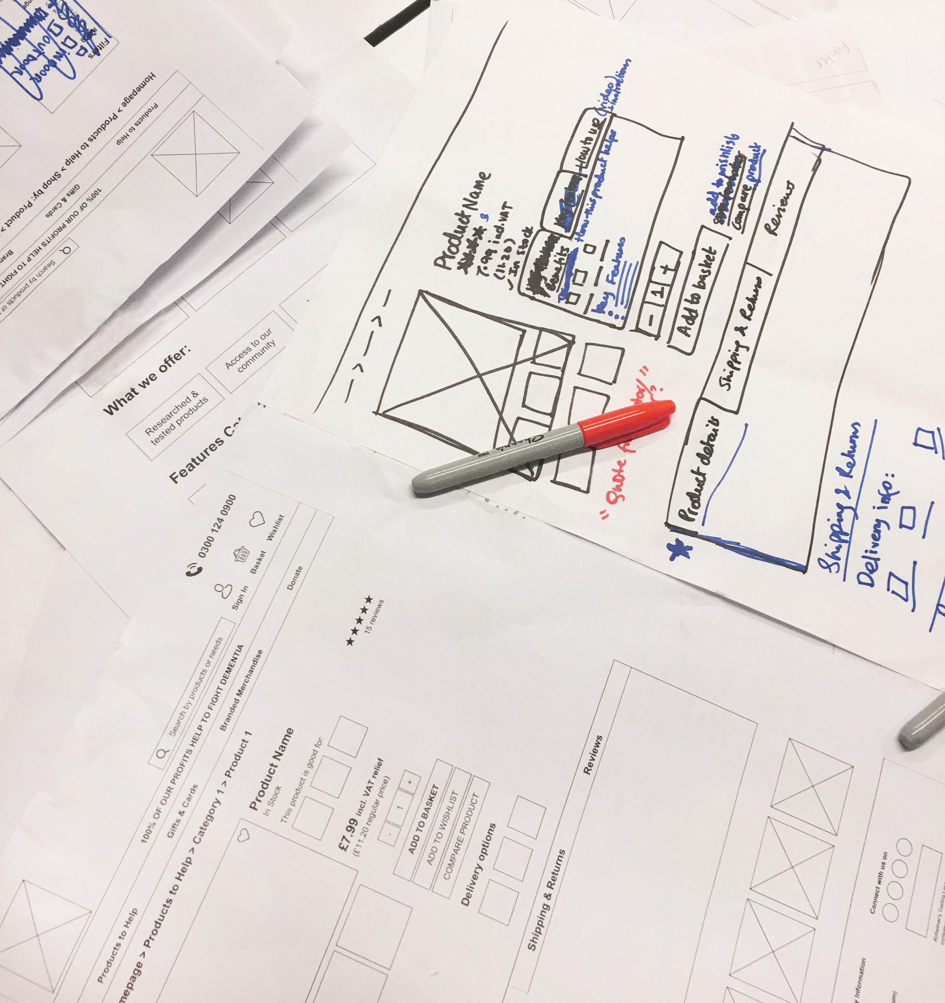
Paper prototype
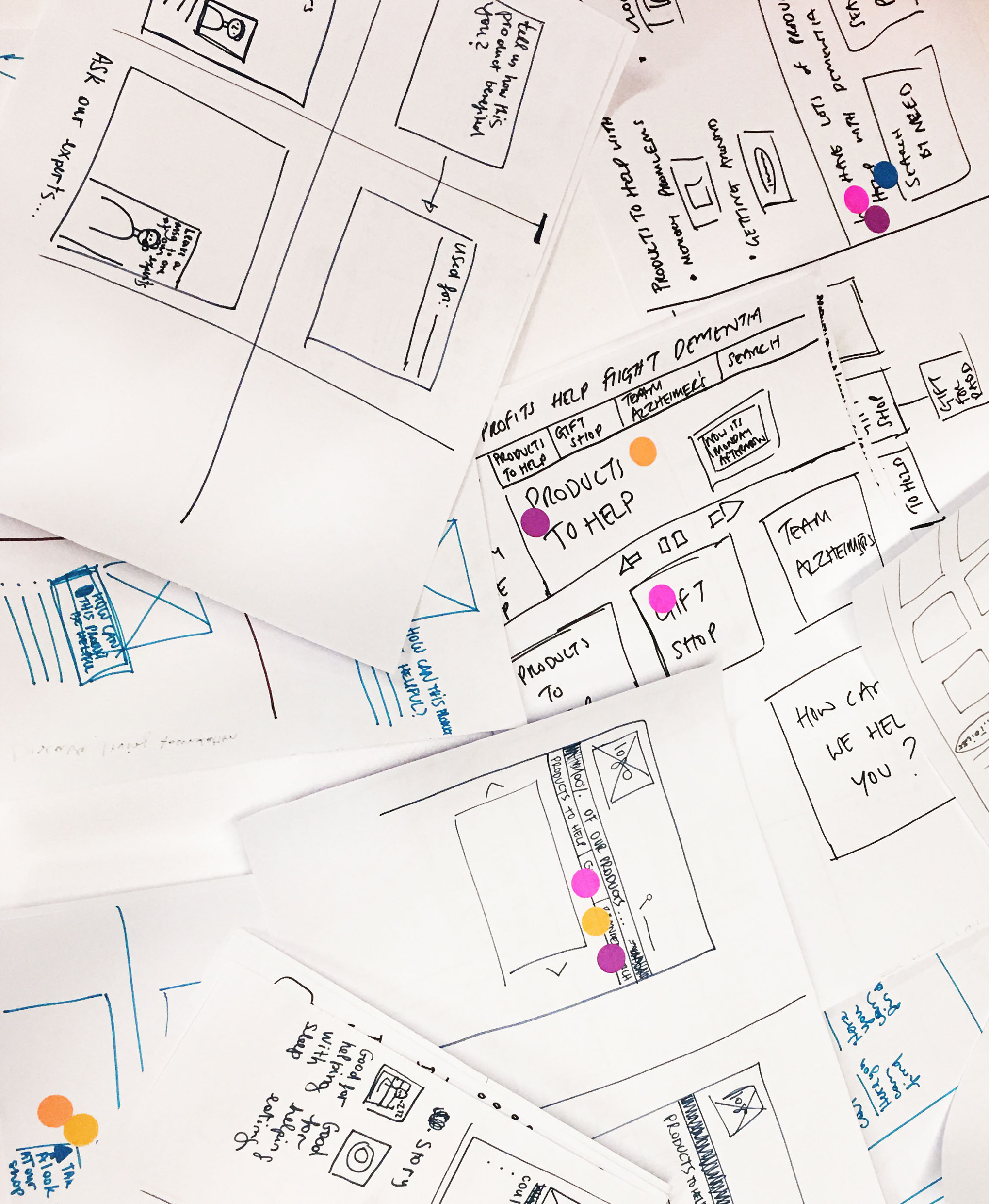
We took the "How might we?" questions to our design studio session that was done with our client.
Next, we sketched combinations of our best and most voted ideas on paper to run the first set of tests with users.
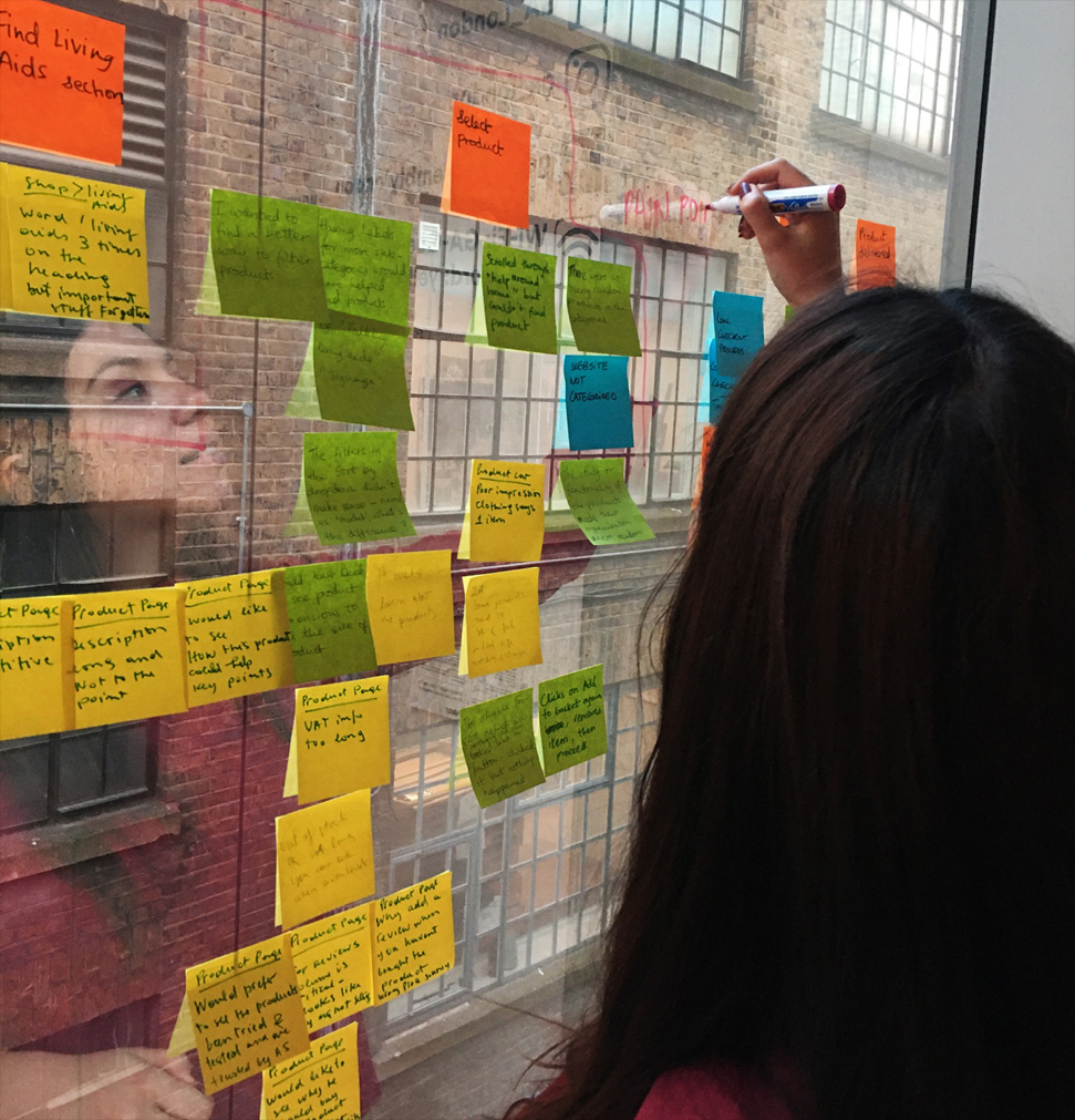
Affinity map – V1
To group the survey results we collected, we created an affinity map to help visualise the pages that would still need to be changed through the iterative process. After testing the paper prototype, many issues appeared in the flow.
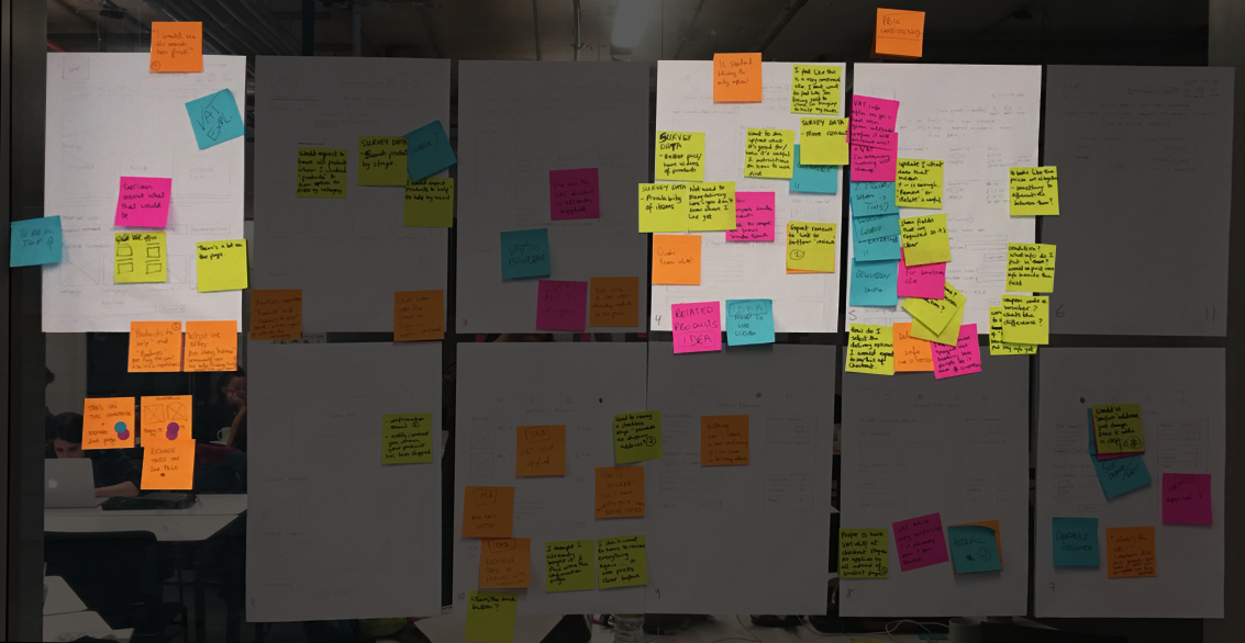
Homepage, product page and applying VAT relief info were the most problematic parts of the flow.
After seeing the homepage was one of the most problematic pages in the flow, the team had two different ideas so we conducted an A/B testing.
A/B test: experiment where two variants of a page are shown to users at random to see which one performs better. We ran two rounds of testing sessions with 12 users in total.
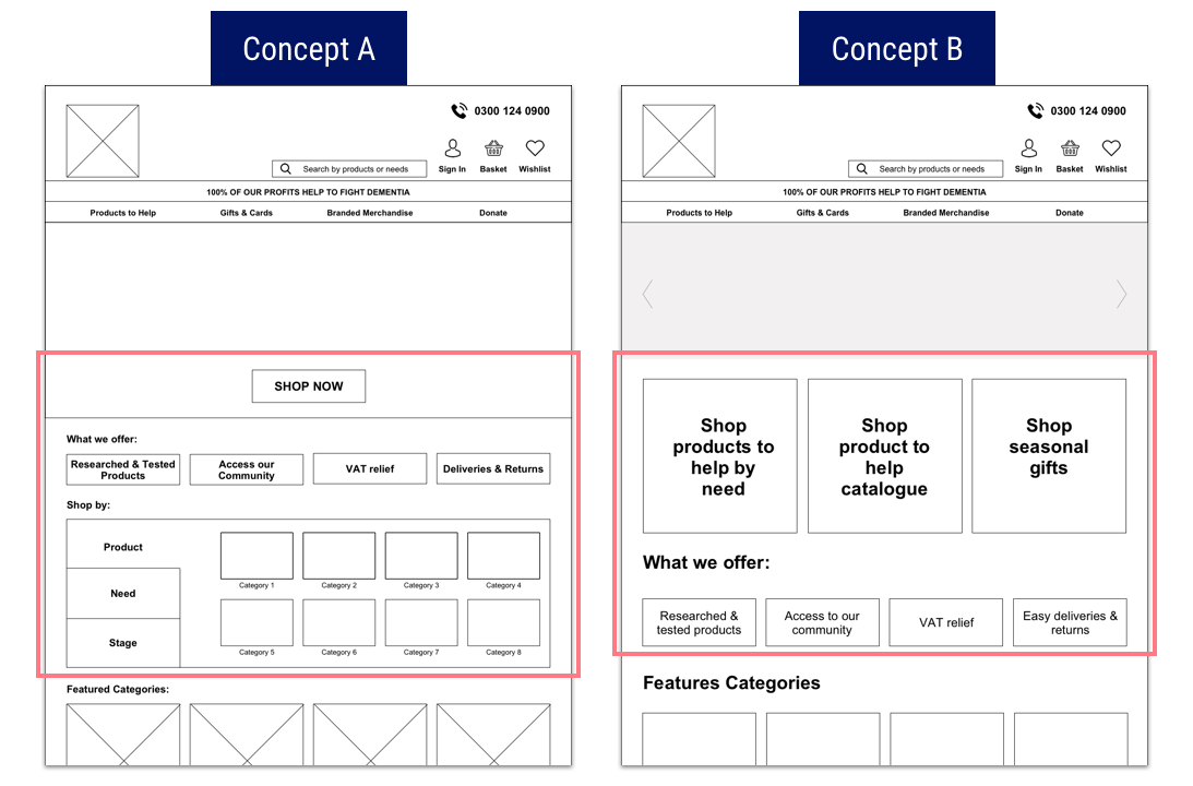
- Concept A: Focused on the “What we offer” section and then showing users they can shop by product, need or stage of the disease.
- Problem: “Shop by” as a tab menu was too confusing as users thought the homepage was too cluttered and overwhelming.
- Concept B: Highlighting that users could shop by need, gifts or from the printed catalogue.
- Problem: “Catalogue” concept was confusing to users and the “What we offer” section wasn’t looking like buttons as the copy wasn’t appropriate.
Affinity map – V2
User Testing Insights
Most painful points on the flow:
- Homepage. It still wasn’t easy and intuitive for users to browse as they had a few issues trying to find the right products.
- Categories page. Users thought the page was a repetition of the dropdown menu.
- Product detail page. VAT relief and product key features were not clear to users.
- Applying VAT relief: It wasn’t intuitive and clear to users when they should apply the information about the patient in order to get the VAT relief.
After collecting all feedback from testing sessions, we iterated the prototype making the changes that would make the flow smoother to users.
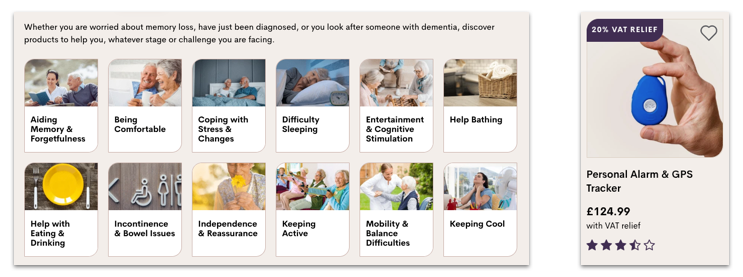
How did we improve the homepage?
We combined A and B concepts to create our final homepage.
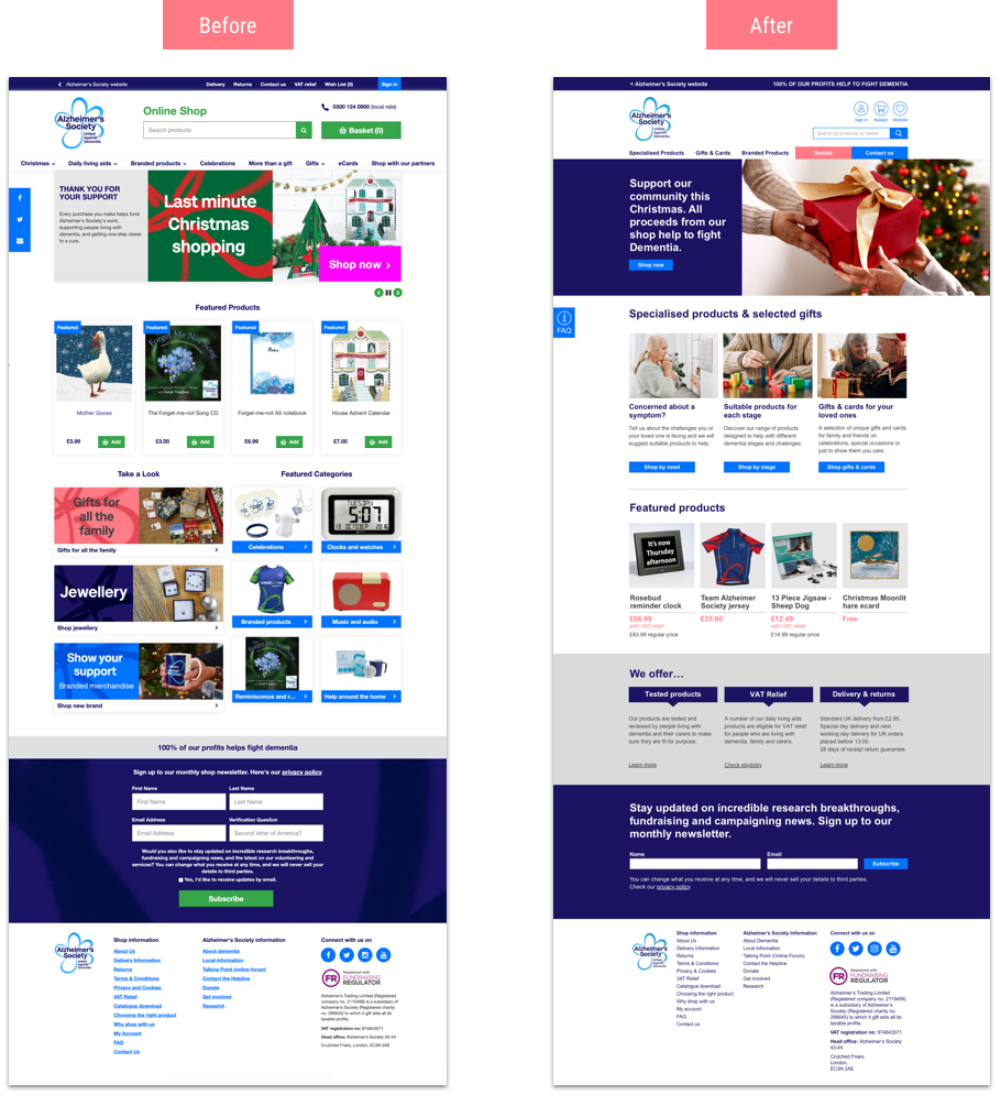
- Changed the daily living aids category title to “Specialised products” – as a result of our card sorting and iterative process.
- Main categories on global navigation are clear and simply showing what the shop offers – specialised products, gifts & cards and branded products.
- Highlighting the “Donate” function with the accent colour.
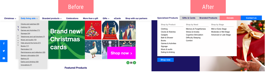
- Dropdown menu to improve navigation being able to shop by product, need or stage – from our research, most users were not sure what to buy so “shop by need” was helpful when guiding them to the right product.
- Adding context for the different ways to shop for daily living aids (product, need and stage).
- Clear design for the bottom global navigation
- Giving the option so users can shop by product, need or stage
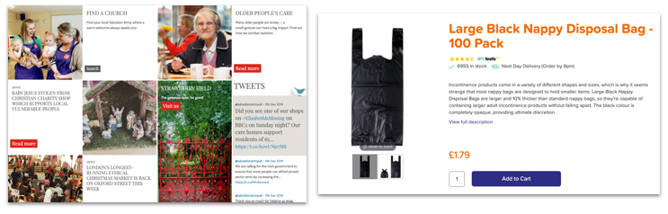
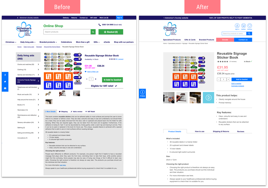
Improving the product details page
When testing our paper prototype, users were confused when choosing the right product. “What is it good for?” was an idea that came from our design studio to highlight the different ways of using the product with icons or pictures. Users thought icons could be quite confusing and not really meaningful.
Delivery cost below the product price was also confusing. Users thought that was the only delivery option. They were also not sure how the website would know this information without their address information.
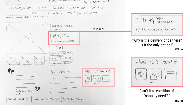
Improvements:
- Prioritising the product benefits and key features above other product information – both can be quickly scanned.
- Removed delivery price.
- De-cluttered the product page.
- Added info about the regular price (without VAT relief).
Clearly communicating USP
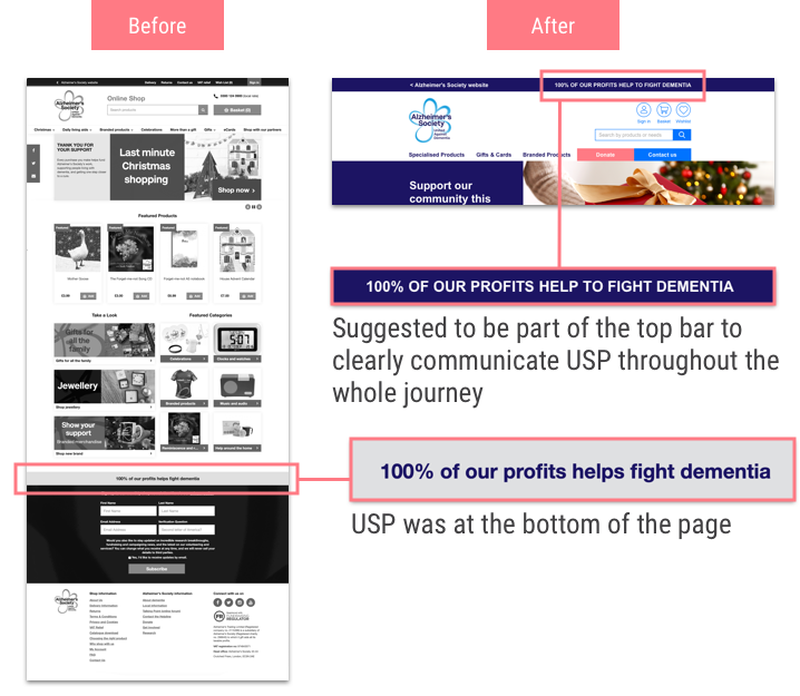
VAT relief process
One of our suggestions for the website was immediately implemented to their current website:
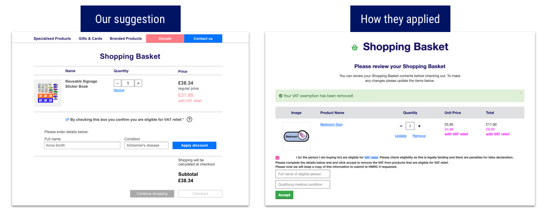
From our testing sessions with users, it was a clear way for them to see where they would need to apply the information to get the VAT relief applied to their purchase.
DELIVER
Design Elements
To apply visual elements to our prototype, we’ve used the existing brand guidelines. Forms and buttons style were applied throughout all pages for consistency. We kept the main blue colours but the light blue was used to represent the call to action. On the previous website, calls to action could either be blue, green or pink and that was confusing to users.
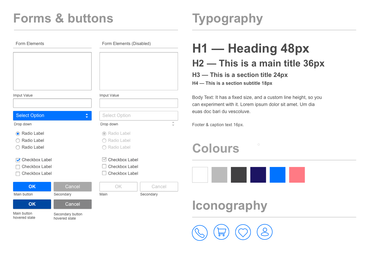
We added grey to the colour palette to counterbalance the bright colours. Grey was already being used on the website but wasn’t highlighted on the guidelines. New icons were also included following the current brand style.
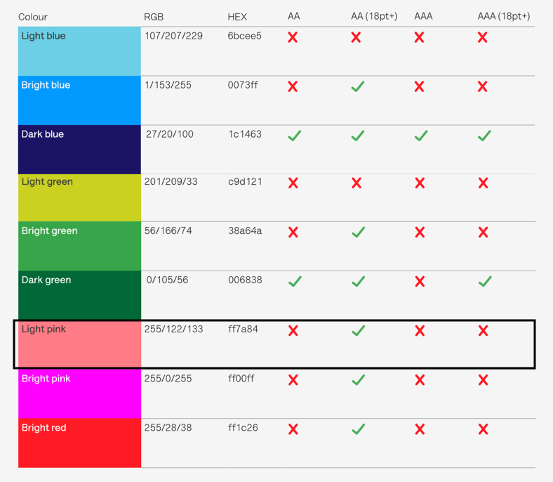
To use the coral pink as an accent colour, we reviewed the typography styles and sizes to make it accessible changing the font size to 18px.
Final Prototype
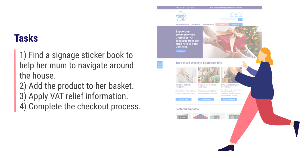
To connect with Holly’s problem and help her achieve her goal we imagined the following scenario:

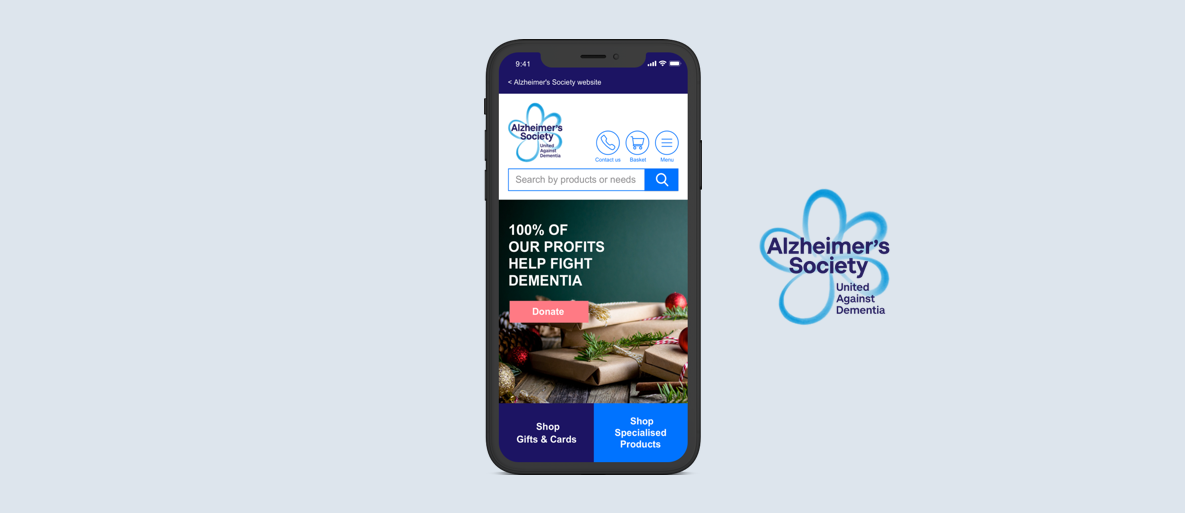
Homepage – Mobile version
Next Steps
- Think about segments – first-time visitors vs. regular customers.
- Develop the whole flow on mobile and iterate.
- Further card sorting to refine categories.
- Revisit tone & voice to soften the language and elevate brand personality.
- Improve visibility of shop on mobile from the main Alzheimer's Society homepage.
What I've learnt...
Working with the Alzheimer’s Society was very rewarding for me. I’ve learnt more about the incredible work they do at the charity and how they want to improve the lives of people living with dementia. The charity’s main goal is that each individual affected by the disease can live well and longer in their own homes. It was challenging to deal with such a delicate subject to users – when it comes to buying specialised products for their loved ones. Our UX Design group received a lot of support from them with all the data provided to help us guide our research. I believe these design changes will improve the overall user experience and in particular streamline the donation process. I’m hoping that those changes result in an increase in donations and purchase of daily living aids. This will help more people living with the disease and everyone around them.